Author Archive


COMPARING MICROBIOLOGICAL TEST METHODS – PART 1

The tool you choose depends on the intended use.


Culture Versus Non-Culture Test Methods

History

There is a false impression among microbiologists and non-microbiologists alike that because culture testing has been around since the mid-19th century, it is a reference method (I’m come back to the reference method concept in a bit). The first quantitative culture-based method – the heterotrophic plate count (HPC) first appeared in Standard Methods for the Examination of Water and Wastewater Standard Methods, 11th Edition, 1960. Since then, thousands of variations of the HPC method have been developed. They differ in the nutrients used (1000s of different recipes), growth conditions under which inoculated Petri plates are incubated (100s of temperature, relative humidity, and gas combinations), and how the specimen is introduced to the medium (pour plate, spread plate, and streak plate methods). Because of the variety of plate count protocols, ASTM offers a practice rather than a test method – D5465 Standard Practices for Determining Microbial Colony Counts from Waters Analyzed by Plating Methods.

Alternative Tools for Measuring Microbial Bioburdens

Between 2016 and 2018 I wrote a series of articles in which I explained common types of microbiological test methods (see What’s New from Early and Late December 2016, February, Early and Late July, and August 2017, January and February 2018). As I wrote in 2016, each method contributes to our understanding of microbial contamination. Although each quantifies a different property of microbial bioburden (i.e., the number of microbes present or the concentration of a chemical that is tends to be proportional to the number of microbes present), the data generated by different methods generally agree. As new methods are used, analysts invariably want to know how the results compare against those obtained by culture testing. ASTM E1326 Standard Guide for Evaluating Non-culture Microbiological Tests reviews consideration that should be taken into account when either evaluating the reliability of a new test method or choosing among available methods.

Reference Test Method

A reference test method is one that is known to provide the most accurate and precise indication of the parameter being tested. Accuracy is the degree to which a measurement or test result agrees with the true or accepted value (for example, an atomic clock – accurate to 10−9 seconds per day – is more accurate than a spring-mechanism wristwatch – the best of which are accurate to 1 second per day). Precision is the degree to which repeated measurements agree. Figure 1 illustrates these two concepts. In Figure 1a, the results (dots on the target) are both accurate – clustered around the bullseye – and precise – close together. The dots in Figure 1b are precise, but not accurate – the cluster is distant from the bullseye. The dots in Figure 1c are accurate – they are near the bullseye, but not particularly precise. To assess a method’s accuracy, you must first have a reference standard – a substance with known properties (for time, the internationally recognized reference standard is the second – 9 192 631 770 cycles of radiation corresponding to the transition between two energy levels of the ground state of the cesium-133 atom at 0 °K). There is no reference microbiological test method because:

  • Under a given set of conditions, different microbes will behave differently. Test results will be affected by the types of microbes present.
  • A given microbe will behave differently as test conditions vary.
  • There is no consensus standard, reference microbe.

Fig 1. Accuracy and Precision – a) dots clustered around bullseye illustrate a high degree of accuracy and precision; b) the tight cluster of dots illustrates precise but inaccurate results; c) the wide spread of dots around the bullseye illustrates accurate but imprecise results.

A consensus standard is one that has been developed and approved under the auspices of a standards development organization such as ASTM, AOAC, ISO, and others. Consensus standard test methods include precision statements that cite interlaboratory study-based repeatability and reproducibility variation, and bias.

Repeatability is a measure of the variability of results obtained by a single analyst testing replicate specimens from a single sample, using a single apparatus and reagents from single lots. Figure 2 illustrates the repeatability variability for an adenosine triphosphate (ATP) test performed on a metalworking fluid sample. The results are Log10 pg mL-1 where REP is the replicate number and [cATP] is the concentration of cellular ATP per ASTM Test Method E2694.

Fig 2. Repeatability testing – one analyst runs replicate tests on specimens from a single sample, then computes average ( and standard deviation (s). a REP – replicate number; b [cATP] – Log10 pg mL-1.

In comparison, nominal HPC repeatability variation is approximately half an order of magnitude (0.5 Log10 CFU mL-1, where CFU is colony forming units).

Reproducibility is a measure the variability among multiple analysts running replicate tests on specimens from a single sample, using different sets of apparatus, and reagents. For stable and homogeneous parameters (for example specific gravity) analysts participating in a reproducibility evaluation (interlaboratory study – ILS) are at different facilities. Because microbial contamination is neither homogeneous nor stable, reproducibility testing is commonly performed by analysts at different work-stations located at a single facility. This is called single-site reproducibility testing. Figure 3 illustrates the results of ASTM E2696 reproducibility testing. Ten labs participated in the ILS. The reproducibility standard deviation (sR) was 0.39. Invariably, sR is greater than the repeatability standard deviation (sr).

Fig 3. Reproducibility testing – multiple analysts run the same test on specimens from a sample, using different lab equipment and reagents.

Bias is the difference between a measurement and a parameter’s true value. The cluster of dots in Figure 1b illustrates bias – the distance between the average position of the dots in the cluster and the target’s actual center. Unless there is a reference standard against which a measurement can be compared, only relative bias – the difference between test results obtained by different methods – can be assessed. Figure 4 illustrates bias and relative bias. A water-miscible metalworking fluid (MWF) has been diluted to prepare emulsions with concentrations ([MWF]) of 1, 2, 3, 4 & 5 % v/v. These are the true concentrations ([MWF]T). Each dilution is tested by two methods: refractive index ([MWF]RI) and acid split ([MWF]AS). Each method’s correlation with [MWF]T = 1.0 (0.998 and 0.997 both round to 1.0). However, each has a bias relative to [MWF]T. In this example, [MWF]RI tends to underestimate [MWF] by 16 % and [MWF]AS tends to over-estimate [MWF] by 20 %. The relative bias between the two methods is 36 % – at any [MWF]T, [MWF]AS = 1.20 [MWF]T and 1.36[MWF]RI. Once bias has been determined, it can be used to correct observed values to either true or reference method values.

Fig 4. Bias – graph depicts calibration curves for refractive index (RI) and acid split (AS) metalworking fluid concentration ([MWF]) test methods. [MWF]T is the true (actual) [MWF], [MWF]RI is the concentration as determined by RI, and [MWF]AS is the concentration as determined by AS. The table lists each method’s bias against the [MWF] standards, and the relative bias between the two methods.

As illustrated in figure 5, when two methods measure the same parameter, r is normally expected to be ≈1.0. Bias is only meaningful between two methods used to measure the same parameter (i.e., characteristic or property).

Fig 5. Regression curve – [MWF]RI v. [MWF]AS.

The relationship I’ve used [MWF] test methods to illustrate in this What’s New article is similar to what one would expect when comparing two different culture test methods – for example ASTM D6974 Standard Practice for Enumeration of Viable Bacteria and Fungi in Liquid Fuels—Filtration and Culture Procedures and ASTM D7978 Standard Test Method for Determination of the Viable Aerobic Microbial Content of Fuels and Associated Water—Thixotropic Gel Culture Method. Calibration curves based on dilutions of an original sample with a population density of X (in figure 6, X = 320 CFU mL-1; 2.5Log10 CFU mL-1) are expected to have slopes and r-values ≈1. Because bioburdens can range across ≥5 orders of magnitude (i.e., from <10 CFU mL-1 to >106 CFU mL-1) data are commonly converted from linear to logarithmic (Log10) values. The data in figurer 6 meet our expectations. The trendline’s slope (y) = -0.85 ≈ 1 and r = 1.

Fig 6. Regression curve – Log10 CFU mL-1 v. Log10 dilution factor.

In my next post, I’ll discuss the relationship between methods that measure different but related properties.

Summary

There are a growing number of test methods that can be used to assess bioburdens. Many of these methods quantify the concentration of a biomolecule or class of biomolecules (adenosine triphosphate, carbohydrates, nucleic acids, proteins, etc.). In this article, I reviewed the basic concepts of data variability – repeatability and reproducibility – and bias, and the expected relationship between two methods that purport to measure the same property (for example, two methods to determine [MWF]). In Part 2 I’ll discuss the principles of comparing different methods for assessing microbial bioburden.

As always, I invite your comments and questions. You can reach me at fredp@biodterioration-control.com.

BIODETERIORATION ROOT CAUSE ANALYSIS – PART 4: CLOSING THE KNOWLEDGE GAPS

Refresher

In my March 2021 article, I began a discussion of root cause analysis (RCA). In that article I reviewed the importance of defining the problem clearly, precisely, and accurately; and using brainstorming tools to identify cause and effect networks or paths. Starting with my April 2021 article I used a case study to illustrate the basic RCA process steps. That post focused on defining current knowledge and defining knowledge gaps. Last month, I covered the next two steps: closing knowledge gaps and developing a failure model. In this post I’ll complete my RCA discussion – covering model testing and what to do afterwards (Figure 1).

Fig 1. Common elements shared by effective RCA processes.

Step 7 Test the Model

As I indicated at the end of May’s post , the data and other information that we collected during the RCA effort led to a hypothesis that dispenser slow-flow was caused by rust-particle accumulation on leak detector screens and that the particles detected on leak detector screens were primarily being delivered with the fuel (regular unleaded gasoline – RUL) supplied to the affected underground storage tanks (UST).

Commonly, during RCA efforts both actionable and non-actionable factors are discovered. An actionable factor is one over which a stakeholder has control. Conversely, a non-actionable factor is one over which a stakeholder does not have control. Within the fuel distribution channel, stakeholders at each stage have responsibility for and control of some factors but must rely on stakeholders either upstream or downstream for others.


For example, refiners are responsible for ensuring that products meet specifications as they leave the refinery tank farm (Figure 2a – whatever is needed to ensue product quality inside the refinery gate is actionable by refinery operators), they have little control over what happens to product once it is delivered to the pipeline (thus practices that ensure product quality after it leaves the refinery are non-actionable).


Pipeline operators (Figure 2b) are responsible for maintaining the lines through which product is transported and ensuring that products arrive at their intended destinations in the – typically distribution terminals in the U.S. – but are limited in what they can add to the product to protect it during transport.


Terminal operators can test incoming product to ensure it meets specifications before it is directed to designated tanks. They are also responsible for maintaining their tanks so that product integrity is preserved while it is at the terminal and remains in-specification at the rack (Figure 2c). Terminal and transport truck operators have a shared responsibility that product is in-specification when it is delivered to truck tank compartments (solid zone where Figures 2c and 2d overlap).


Tanker truck operators are also responsible for ensuring that tank compartments are clean (free of water, particulates, and residual product from previous loads). Additionally, truck operators (Figure 2d) are responsible for ensuring that tanker compartments are filled with the correct product and that correct product is delivered into retail and fleet operator tanks. They do not have any other control over product quality.


Finally, retail and fleet fueling site operators are responsible for the maintenance of their site, tanks, and dispensing equipment (Figure 2e).


Regarding dispenser slow-flow issues, typically only factors inside the retail sites’ property lines are actionable (Figure 3 – copied from May’s post).

Fig 2. Limits of actionability at each stage of fuel product distribution system – a) refinery tank farm; b) pipeline; c) terminal tank farm; d) tanker truck; and e) retail or fleet fuel dispensing facility. Maroon shapes around photos reflect actionability limits at each stage of the system. Note that terminal and tanker truck operators share responsibility for ensuring that the correct, in-specification product is loaded into each tank compartment.

Fig 3. Dispenser slow-flow failure model.

As illustrated in Figure 3, the actions needed to prevent leak detector strainer fouling were not actionable by retail site operators. In this instance, we were fortunate in that the company whose retail sites were affected owned and operated the terminal that was supplying fuel to those sites.


A second RCA effort was undertaken to determine whether the rust particle issue at the retail sites was caused by actionable factors at the terminal. We determined that denitrifying bacteria were attacking the amine-carboxylate chemistry used as a transportation flow improver and corrosion inhibitor. This microbial activity:

– Created an ammonia odor emanating from the RLU gasoline bulk tanks,

– Increased the RUL gasoline’s acid number, and

– Made the RUL gasoline slightly corrosive.


Although the rust particle load in each delivery was negligible (i.e., <0.05 %), the total amount of rust delivered added up quickly. If the rust particle load was 0.025 %, 4 kg (8.8 lb) of particles would be delivered with each 26.5 m3 (7,000 gal; 19,850 kg) fuel drop. The sites received an average of two deliveries per week (some sites received one delivery per week and others received more than one delivery per day). That translates to an average of 32 kg (70 lb) of particulates per month. Corrective action at the terminal eliminated denitrification in the RUL gasoline bulk tanks and reduced particulate loads in the RUL gasoline to <0.01 %.


Step 8. Institutionalize Lessons Learned

Although the retail site operators could not control the quality of the RUL gasoline they received, there were several actionable measures they could adopt.

1. Supplemented automatic tank gauge readings with weekly manual testing, using tank gauge sticks and water-finding paste. At sites with UST access at both the fill and turbine ends, manual gauging was performed at both ends.

2. Use a bacon bomb, bottom sampler to collect UST bottom samples once per month. Run ASTM Method D4176 Free Water and Particulate Contamination in Distillate Fuels (Visual Inspection Procedures) to determine whether particles were accumulating on UST bottoms. As for manual gauging, at sites with UST access at both the fill and turbine ends, bottom sampling was performed at both ends.

3. Evaluate particulate load for presence of rust particles by immersing a magnetic stir bar retriever into the sample bottle and examining the particle load on the retriever’s bottom (Figure 4).

4. Set bottoms-water upper control limit (UCL) at 0.64 cm (0.25 in) and have bottoms-water vacuumed out when they reach the UCL.

5. Set rust particle load UCL at Figure 4 score level 4 and have UST fuel polished when scores ≥4 are observed.

6. Test flow-rates at each dispenser weekly – reporting flow rate and totalizer reading. Compute gallons dispensed since previous flow-rate test. Maintain a process control chart of flow-rate versus gallons dispensed.

Fig 4. Qualitative rust particle test – a) magnetic stir bar retriever; b) attribute scores for rust particle loads on retriever bottom, ranging from 1 (negligible) to 5 (heavy).

These six actions were institutionalized as standard operating procedure (SOP) at each of the region’s retail sites. Site managers received the requited supplies, training on proper performance of each test, and instruction on the required record keeping. There has been no recurrence of premature slow-flow issues at any of the retail sites originally experiencing the problem.


Wrap Up

Although I used a particular case study to illustrate the general principles of RCA, these principles can be applied whenever adverse symptoms are observed. I have used this approach to successfully address a broad range of issues across many different chemical process industries. The keys to successful RCA include carefully defining the symptoms and taking a global, open-minded, multi-disciplinary approach to defining the cause-effect paths that might be contributing to the observed symptoms. Once a well-conceived cause-effect map has been created, the task of assessing relative contributions of individual factors becomes fairly obvious, even when the amount of actual data might be limited.


Bottom line: effective RCA addresses contributing causes rather than focusing only on measures that only address symptoms temporarily. In the fuel dispenser case study, retail site operators initially assumed that slow-flow was due to dispenser filter plugging. Moreover, they never checked to confrim that replacing dispenser filters affected flow-rates. This short-sighted approach to problem solving is remarkably common across many industries. To learn more about BCA’s approach to RCA, please contact me at fredp@biodeterioration-control.com.

BIODETERIORATION ROOT CAUSE ANALYSIS – PART 3: CLOSING KNOWLEDGE GAPS

Former U.S. Secretary of Defense Donald Rumsfeld statement from 12 February 2002, Department of Defense news briefing.

RCA Universal Concepts

Before discussing RCA’s fifth and sixth steps I’ll again share the figure I include with my April article. Successful RCA includes eight primary elements. Figure 1 illustrates the primary RCA process steps, with Steps 5 & 6 highlighted.

Fig 1. Common elements shared by effective RCA processes.

Steps 1 through 4 Refresher: Define the Problem, Brainstorm, Define Current Knowledge, and Define Knowledge Gaps

In my March and April articles I explained he first four steps of the RCA process. This month I’ll write about the next two steps: closing the knowledge gaps and developing a model. I’ll continue to use the fuel dispenser, slow-flow case study to illustrate the RCA process.

As I discussed in April, Step 4 was defining knowledge gaps. There is a story about Michelangelo having been asked how he created his magnificent statue of David. Michelangelo is reported to have replied that it was simply a matter of chipping away the stone that wasn’t David (Figure 2). Similarly, once we have identified what we want to know about the elements of the cause-effect map and have determined what we currently know, what remains are the knowledge gaps.

Fig 2. Michelangelo’s David (1504).

Step 5 – Close Knowledge Gaps

When the cause-effect map is complex, and little information is available about numerous potential contributing factors, the prospect of filling knowledge gaps can be daunting. To overcome this feeling of being overwhelmed by the number of things we do not know, consider the meme: “How do you eat an elephant? One bite at a time.” Figure 3 (April’s Figure 7) shows that except for the information we have about metering pump’s operation, we have no operational data or visual inspection information about the other most likely factors that could have been contributing to slow-flow. The number of unknowns for even this relatively simple cause-effect map is considerable. Attempting to fill all of the data gaps before proceeding to Step 6 can be time consuming, labor intensive, and cost prohibitive. The alternative is to prioritize the information gathering process and then start with efforts that are likely to provide the most relevant information at least cost in the shortest period of time.

Regarding the dispenser slow-flow issue, the first step was to review the remaining first tier causes. Based on the ease, speed, and cost criteria I mentioned in the preceding paragraph we created a plan to consider the causes in the following order (Figure 4):

1. Inspect strainers to see if they were fouled.
2. Test for filter fouling – test flow-rate, replace filter, and retest flow-rate immediately.
3. Pull the submerged turbine pump (STP) – inspect the turbine distribution manifold’s leak detector strainer.
4. Inspect STP for damage.
5. Inspect flow control valve for evidence of corrosion, wear, or both.

Fig 3. Initial slow-flow cause-effect map showing tier 1 factors likely to be causing slow-flow either individually or collectively. Question marks indicate knowledge gaps.

Fig 4. Flow diagram – testing possible, proximal slow flow-causes.

The plan was to cycle through the Figure 4 action steps until an action restored dispenser flow-rates to normal. As it turned out, the leak detector screen had become blocked by rust particles (Figure 5). Replacing it restored flow-rates to 10 gpm (38 L min-1).

Fig 5. Turbine distribution manifold lead detector – left: screen collapsed due to plugging; right: screen removed.

As illustrated in Figure 6, once we determined that slow-flow had been caused by rust particles having been trapped in the leak detector’s screen, were able to redraw the cause-effect diagram, and consider the factors that might have contributed to the scree’s failure. Direct observation indicated that the screen was slime-free. Passing a magnetic stir-bar retriever over the particles demonstrated that they were magnetic – corrosion residue. When the STP risers were pulled, the risers (pipe that runs from STP to turbine distribution manifold) were inspected for corrosion. We acknowledged that substantial corrosion could be present on the risers’ internal surfaces when there is no indication of exterior corrosion but determined that it would be more cost effective to collect samples from the terminal before performing destructive testing on STP risers. The underground storage tanks were made from fiber reinforced polymer (FRP). This decreased the probability of in-tank corrosion being a significant contributing factor.

Fig 6. – Revised cause-effect map based on determination that rust particle accumulation had restricted flow through the turbine distribution manifold.

The UST bottom-sample shown in Figure 7 was typical of turbine-end samples. The bottoms-water fraction was opaque, black, and loaded with magnetic (rust) particles. This observation supported the theory that the primary source of corrosion particles that had been trapped by the leak detector’s screen had been delivered (upstream) fuel.

Fig 7. UST bottom sample showing the presence of bottoms-water containing a heavy suspended solids load. Inset shows a magnetic stir bar retriever that had been dipped into the sample. It is coated with rust particles.

At this point in the root cause analysis process, we had closed the relevant knowledge gaps related to on-site component performance. This enabled us to propose a failure mechanism model.

Step 6 – Develop Model

The model that we developed, based on the observations made during the Step 6 effort, indicated that reduced flow-rates at retail dispensers were caused by rust particle accumulation on leak detector screens, and that the primary source of those particles was the delivered fuel (upstream – Figure 8). Similar observations at multiple retail sites that were supplied from the same terminal supported this hypothesis. Moreover, only 87 octane (regular unleaded gasoline – RUL) was affected. Mid-grade, premium, and diesel flow-rates at all sites were normal. Note the dashed line in Figure 8. Although there were steps retail site operators could take to reduce the impact, they had no control over causes and effects upstream of their properties.

Fig 8. Dispenser slow-flow failure model.

To test this model our next step was to conduct a microbial audit of the RUL bulk storage tanks at the terminal. That is Step 7, the subject of Biodeterioration Root Cause Analysis – Part 4.

For more information about biodeterioration root cause analysis, contact me at fredp@biodeterioration-control.com

BIODETERIORATION ROOT CAUSE ANALYSIS – PART 2: IDENTIFYING THE KNOWN KNOWNS AND THE KNOWN UNKNOWNS


Former U.S. Secretary of Defense Donald Rumsfeld statement from 12 February 2002, Department of Defense news briefing.


RCA Universal Concepts

Before discussing RCA’s third and fourth steps I’ll again share the figure I include with my March article. Successful RCA includes eight primary elements. Figure 1 illustrates the primary RCA process steps.

Fig 1. Common elements shared by effective RCA processes.

Steps 1 & 2 Refresher. Define the Problem and Brainstorm

One of the most common misidentifications of a problem comes from the fuel retail and fleet operation sector. The actual symptom, slow flow, it typically misdiagnosed as filter pugging. As I wrote in March’s article: failure to define a problem properly can result in wasted time, energy, resources, and ineffective RCA.

This month I’ll use a fuel dispenser, slow-flow case study to illustrate the next two steps: defining current knowledge and defining knowledge gaps. First, let’s define the problem. At U.S. retail sites (forecourts), the maximum fuel dispenser flowrate is 10 gpm (38 L min-1) and normal flow is ≥7 gpm (≥26 L min-1). In our case study, customers complained about dispenser flow rates being terribly slow. The site manager assuming that the reduced flowrate was caused by filter plugging (Figure 2a) reported “filter plugging, rather than reduced flow (slow-flow). He called the service company. The service company sent out a technician and the technician replaced the filter on the dispenser with the reported slow-flow issue.

Before going any further, I’ll note that the technician did not test the dispenser’s flowrate before or after changing the filter. Nor did he test the other 12 dispensers’ flowrates. He did not record the totalizer reading (a totalizer is a device that indicates the total number of gallons that have been dispensed through the dispenser). He did not mark the installation date or initial totalizer reading on the new filter’s cannister. As a result, he missed an opportunity to capture several bits of important information I’ll come back to later in this article. A week later, customers were again complaining about reduced flow from the dispenser. This cycle of reporting slow flow, replacing the filter, then repeating the cycle on a nearly weekly basis continued for several months. A similar cycle occurred at two other dispensers at this facility and a several other forecourts in the area. That’s when I was invited to help determine why the company was using so many dispenser filters. By the way, the total cost to have a service representative change a filter was $130, of which $5 was for the filter and $125 was for the service call.

My first action, after listening to my client’s narrative about the problem, was to suggest that they reframe the issue (i.e., presenting symptom). Instead of defining the problem as filter plugging, I suggested that we define it as slow-flow (Figure 2b). At the corporate level, normal flow ≥ 7 gpm (26 L min-1). Testing a problem dispenser, we observed 4 gpm (17 L min-1). At this point my client’s team members were still certain that the slow-flow was caused by filter plugging, caused by microbial contamination.

Fig 2. Problem definition – a) original definition: filter plugging; b) revised definition: slow-flow, caused by filter plugging.

Once everyone recognized that the issue was slow-flow, they were willing to brainstorm to consider all of the possible causes of slow-flow. Within a few minutes, we had develop a list of six possible factors (causes) that could individually, or in combination have caused slow-flow (Figure 3). As the brainstorming process continued, we mapped out a total of six tiers of factors that could have contributed to dispenser flowrate reduction (Figures 4 and 5). During the actual project, individual cause-effect maps were created for each of the tier 2 causes (Corrosion, etc. in Figure 4) and each of the tier 3 causes (Microbes (MIC), etc. in Figure 4), and the mapping extended to a total of nine cause tiers. Note how the map provided a visual tool for considering likely paths that could have been leading to the slow-flow issue.

Fig 3. Initial slow-flow cause-effect map showing tier 1 factors likely to be causing slow-flow either individually or collectively.

Fig 4. Slow-flow cause-effect map showing possible causes, tiers 1 through 4.

Once the team had completed the brainstorming effort, we were ready to move to the next step of the RCA process.

Fig 5. Slow-flow cause-effect map showing possible causes, tiers 2 through 6. To simplify image, higher tier causes are shown only for selected factors (e.g., Chemistry and Microbiology).

Step 3 – Define Current Knowledge

Simply put, during this step, information from product technical data and specification sheets, maintenance data, and condition monitoring records is captured to identify everything that is known about each of the factors on the cause effect map. In our case study, key information was added to the cause-effect map by each factor (Figure 6). For most of the tier 1 factors, we were able to identify component model numbers. The most information was available for the dispenser filters. The product technical data sheets indicated that filters were 10 μm nominal pore size (NPS), were designed to filter approximately 1 million gal (3.8 million L) of nominally clean fuel before the pressure differential (ΔP) across the filter reached 20 psig (139 kPa).

Fig 6. Partial slow-flow cause-effect map with tier 1 factor information added.

Determining current knowledge provides the basis for the next step.

Step 4 – Identify Knowledge Gaps

Determining the additional information needed to support informed assessments of the likelihood of any individual factor or combination of factors is contributing to the ultimate effect is typically a humbling experience because much of the desired information does not exist. Figure 7 is a copy of figure 4, with question marks alongside the factors for which there was insufficient information. The dispenser metering pumps had been calibrated recently and were known to be functioning properly. Consequently, Meter Pump Malfunction and its possible causes can be deleted from the map. However, there were no data for the condition or performance of the other five tier 1 causes.

Fig 7. Slow-flow cause-effect map indicating factors for which relevant information is missing (as indicated by “?” to left of factor).

As figure 7 illustrates, at this point we had minimal information about most of the possible causative factors. We discovered a long list of knowledge gaps. Here are a few examples:

  • Whether dispenser, turbine distribution, manifold (TDM) or both strainers were fouled
  • Whether ΔP across filter ≥20 psig
  • Whether the flow control vale or submerged turbine pump (STP) were functioning properly

Obtaining information about these tier 1 factors was critical to the success of the RCA effort. That will be our next step. In my next article I’ll discuss strategies for closing the knowledge gaps and preparing a failure process model.

For more information, contact me at fredp@biodeterioration-control.com.

BIODETERIORATION ROOT CAUSE ANALYSIS – PART 1: FIRST STEPS

Cause: Stabbing balloon with nail. Effect: A popped balloon.

What is root cause analysis?

Root cause analysis (RCA) is the term used to describe any of various systematic processes used to understand why something is occurring or has occurred. In this post and several that follow, I’ll focus on an approach that I have found to be useful over the years. Regardless of the specific tools used effective RCA includes both subjective and objective elements. The term root cause is often misunderstood. The objective of RCA is to identify relevant factors and their interactions that contribute to the problem. Only on rare occasions will a single cause be responsible of the observed effect. The cause-effect map of the Titanic catastrophe – available at thinkreliability.com – illustrates this concept beautifully. Although striking an iceberg was the proximal (most direct) cause of the ship sinking, there were numerous other contributing factors.

Typically, the first step is the recognition of a condition or effect. Recognition is a subjective process. An individual looks at data and makes a subjective decision as to whether they reflect normal conditions. The data on which that decision is made are objective. RCA tools use figures or diagrams to help stakeholders visualize relationships between effects and the factors that potentially contribute to those effects. Figure 1 illustrates the use of Post-it® (Post-it is a registered trademark of 3M) notes on a wall to facilitate RCA during brainstorming sessions.

Fig 1. Using Post-it® notes to brainstorm factors contributing to balloon popping.

This simplistic illustration shows how RCA encourages thinking beyond the proximal cause(s) of undesirable effects.

RCA Universal Concepts

At first glance, the various tools used in RCA seem to have little in common. Although the details of each step differ among alternative RCA processes, the primary elements remain the same. Figure 2 illustrates the primary RCA process steps.

Fig 2. Common elements shared by effective RCA processes.

Step 1. Define the problem

For millennia, sages have advised that the answers one gets depend largely on the questions one asks. The process of question definition – also called framing – is often given short shrift. However, it can make all the difference in whether or not an RCA effort succeeds. Consider reduced flow in systems in which a fluid passes through one or more filters. As I’ll illustrate in a future article, reduced flow is commonly reported as filter plugging. To quote George Gershwin’s lyrics from Porgy and Bess: “It Ain’t Necessarily So.” Failure to define a problem properly can result in wasted time, energy, resources, and ineffective RCA.

Step 2. Brainstorm

Nearly every cause is also an effect. Invariably, even the nominally terminal effect is the cause of suboptimal operations. Brainstorming is a subjective exercise during which all stakeholders contribute their thoughts on possible cause-effect relationships. The Post-it® array shown in Figure 1 illustrates one tool for capturing ideas floated during this brainstorming effort. On first pass, no ideas are rejected. The objectives are to identify as many contributing factors (causes, variables) as stakeholders can, collectively, and to map those factors as far out as possible – i.e., until stakeholders can no longer identify factors (causes) that might contribute – however remotely – to the terminal effect (i.e., the problem). Two other common tools used to facilitate brainstorming are fishbone (Ishikawa or herringbone) diagrams (Figures 3 and 4), and Cause-Effect (C-E) maps (Figure 5). Kaoru Ishikawa introduced fishbone diagrams in the 1960s. Figure 3 shows a generic fishbone diagram. The “spine” is a horizontal line that points to the problem. Typically, six Category lines radiate off the spine. Horizontal lines off of each category line are used to list causes related to that category. One or more sub-causes can be associated with each cause.

Fig 3. Generic fishbone diagram.

Figure 4 illustrates how a fishbone diagram can be used to visualize cause-effect relationships contributing to a balloon popping.

Fig 4. Fishbone diagram of factors possibly contributing a popped balloon.

The six categories – Environment, Measurement, Materials, Machinery, Methods, and Personnel – are among those most commonly used in fishbone diagramming. Keep in mind that at this point in RCA, the variables captured in the diagram are speculative. Only the fact that the balloon has popped is know for certain.

Fig 5. Cause-Effect (CE) map – popped balloon.

My preferred tool is C-E mapping. The cells in a C-E map suggest causal relationships – i.e., a causal path. This is similar to repeatedly asking: why?” and using the answers to create a map. In Figure 5, there are three proximal causes to the Balloon Popped effect. The balloon popped because it was punctured, over-heated, or overinflated. In this illustration only the possible causes of Punctured are illustrated. The two possible causes are Intention and Accident. In turn, Intention could have been the effect of either playfulness or anger. The accident could have been caused by handing the balloon with the wrong tool (hands with sharp nails?) or having applied too much pressure. Although Figure 5 shows three tiers of causes, it could be extended by several more tiers. For example, why was the individual handling the balloon angry? Why did whatever made them angry occur? As I’ll illustrate in a future article, one advantage of C-E mapping is that the entire diagram need not be shown in a single figure. Each listed cause at each tier can be used as the ultimate effect for a more detailed C-E map. Another advantage is that ancillary information can be provided alongside each cause cell (Figure 6).

Fig 6. Portion of Figure 5 showing ancillary information about balloon’s properties.

In my next article, I’ll continue my explanation of RCA, picking up the story with Define Current Knowledge and will use a biodeterioration case study to illustrate each step.

Summary

In RCA, the objective is to look beyond the proximal cause. My intention now is to explain why this is valuable. I recognize that some readers are Six-Sigma Black Belts who understand RCA quite well. Still, all too frequently, I encounter industry professionals who invariably focus no proximal causes and wonder why the same symptoms continually recur.

For more information, contact me at fredp@biodeterioration-control.com.

Minimizing Covid-19 Infection Risk In The Industrial Workplace


Electron microscopy image of the SARS-CoV-2 virus.


COVID-19 Infection Statistics

Although anti-COVD vaccines are rolling out and people are being immunized, as of early late December 2020, the rate at which daily, newly reported COVID-19 cases has continued to rise (Figure 1). In my 29 June 2020 What’s New article I discuss some of the limitations of such global statistics. In that post, I argued that the statistics would be more meaningful if the U.S. Centers for Disease Control’s (CDC’s) morbidity and mortality reporting standards were used. Apropos of COVID-19, morbidity refers to patients’ cases reported and having the disease and mortality refers to COVID-19 patients who die from their COVID-19 infection. Both morbidity and mortality are reported as ratios of incidence per 100,000 potentially exposed individuals. I illustrated this in my portion of an STLE webinar presented in July 2020.


Fig 1. Global incidence of new COVID-19 cases – daily statistics as of 23 December 2020 (source: coronavirusstatistics.org).


What Do the Infection Statistics Mean?

Social scientists, epidemiologists, and public health specialists continue to debate the details, but the general consensus is that the disease spreads most widely and rapidly when individuals ignore the fundamental risk-reduction guidelines. It appears that COVID 19 communicability is proportional to the number of SARS-CoV-2 virus particles to with individuals are exposed. Figure 2 illustrates the relative number of virus particles shed during the course of the disease.


Fig 2. Relationship between number of SARS-2CoV viruses shed and COVID-19 disease progression.


Notice that the number of viruses shed (or dispersed by sneezing, coughing, talking, and breathing) is quite large early on – before symptoms develop fully. It’s a bit more complicated than that, however. Not all infected individuals are equally likely to shed and spread the virus. All things being apparently equal, some – referred to as super-spreaders – are substantially more likely than others to infect others. Although people with or without symptoms can be super-spreaders, those who are infected but asymptomatic are particularly dangerous. These folks do not realize that they should be self-quarantining. A study published in the 06 November 2020 issue of Science (https://science.sciencemag.org/content/370/6517/691) reported that epidemiological examination of millions of COVID-19 cases in India revealed that 5 % of infected people were responsible for 80 % of the reported cases.

What Shall We Do While Waiting for Herd Immunity to Kick-In?

The best strategy for avoiding the disease is to keep yourself physically distanced form others. Unfortunately, this advise is all but worthless for most people. We use public transportation to commute to work. We teach in classrooms, work in offices, restaurants, medical facilities, and industrial facilities in which ventilation systems are unable to exchange air frequently enough to minimize virus exposure risk. The April 2020 ASHRE Position Document on Infectious Aerosols recommends the use of 100 % outdoor air instead of indoor air recirculation. The same document recommends the used of high-MERV (MERV – minimum efficiency removal value – 10-point scale indicating the percentage of 0.3 µm to 10 µm particles removed) or HEPA (HEPA – high efficiency particulate absorbing – able to remove >99.9% of 0.3µm particles from the air) filters on building HVAC systems. Again, as individuals who must go to work, shop for groceries, etc., outside our own homes, we have little control over building ventilation systems.

Repeatedly, CDC (Centers for Disease Control), HSE (UK’s Health and Safety Executive), and other similar agencies have offered basic guidance:

1. Wear face masks – the primary reasons for doing this is to keep you from transmitting aerosols and to remind you to keep your hands away from your face. Recent evidence suggests that that although masks (except for ones that meet N-95 criteria) are not very efficient at filtering viruses out of the air inhaled through them, they do provide some protection.

2. Practice social distancing to the extent possible. The generally accepted rule of thumb is maintaining at least 6 ft (1.8 m) distance between people. This is useful if you are in a well-ventilated space for relatively short periods of time but might be insufficient if you are spending hours in inadequately ventilated public, industrial, or institutional spaces.

3. Wash hands thoroughly (at least 30 sec in warm, soapy water) and frequently. The objective here is to reduce the chances of first touching a virus laden surface and then transferring viruses into your eyes, nose, or mouth.

Here are links to the most current guidance documents:

CDC – How to Protect Yourself and Othershttps://www.cdc.gov/coronavirus/2019-ncov/prevent-getting-sick/prevention.html

CDC – Interim Guidance for Businesses and Employers Responding to Coronavirus Disease 2019 (COVID-19), May 2020https://www.cdc.gov/coronavirus/2019-ncov/community/guidance-business-response.html

HSE – Making your workplace COVID-secure during the coronavirus pandemichttps://www.hse.gov.uk/coronavirus/working-safely/index.htm

UKLA- HSE Good Practice Guide – http://www.ukla.org.uk/wp-content/uploads/HSE-Good-Practice-Guide-Sept20-Web-LowresC.pdf – discusses health & safety in the metalworking environment.

WHO – Coronavirus disease (COVID-19) advice for the publichttps://www.who.int/emergencies/diseases/novel-coronavirus-2019/advice-for-public

Remember: Prevention really Means Risk Reduction

It is impossible to reduce the risk of contracting COVD-19 to zero. However, timely and prudent preventative measures can reduce the risk substantially so that people can work, shop, and interact with one another safely. Guidance details continue to evolve as researchers learn more about SAR-CoV-2 and its spread. However, the personal hygiene basics have not changed since the pandemic started a year ago. If each of us does our part, we will be able to reduce the daily rate of new cases dramatically, long before the majority of folks have been immunized.

For more information, contact me at fredp@biodeterioration-control.com

Sensitivity Training – Detection Limits Versus Control Limits


Meme from the 1986 movie, Heartbreak Ridge (Gunnery Sergeant Thomas Highway – Clint Eastwood – is providing sensitivity training to his Marines).


The Confusion

Over the past several months, I have received questions about the impact of test method sensitivity on control limits. In this post, I will do my best to explain why test method sensitivity and control limits are only indirectly related.

Definitions (all quotes are from ASTM’s online dictionary)

Accuracy – “a measure of the degree of conformity of a value generated by a specific procedure to the assumed or accepted true value and includes both precision and bias.”

Bias – “the persistent positive or negative deviation of the method average value from the assumed or accepted true value.”

Precision – “the degree of agreement of repeated measurements of the same parameter expressed quantitatively as the standard deviation computed from the results of a series of controlled determinations.”

Figures 1a and b illustrate these three concepts. Assume that each dot is a test result. The purple dots are results from Method 1 and the red dots are from Method 2. In figure 1a, the methods are equally precise – the spacing between the five red dots and between the five purple dots is the same. If these were actual measurements and we computed the average (AVG) values and standard deviations (s), s1 = s2. However, Method 1 is more accurate than Method 2 – the purple dots are clustered around the bull’s eye (the accepted true value) but the red dots are in the upper right-hand corner, away from the bull’s eye. The distance between the center of the cluster of red dots and the target’s center is Method 2’s bias.


Figure 1. Accuracy, precision, and bias – a) Methods 1 & 2 are equally precise, but Method 2 has a substantial bias; b) Methods 1 & 2 are equally accurate, but Method 1 is more precise – the dots are clustered closer together than those from Method 2.

Limit of Detection (LOD) – “numerical value, expressed in physical units or proportion, intended to represent the lowest level of reliable detection (a level which can be discriminated from zero with high probability while simultaneously allowing high probability of non-detection when blank samples are measured.” Typically test methods have a certain amount of background noise – non-zero instrument readings observed when the test is run on blanks (test specimens known to have none of the stuff being analyzed).

I have illustrated this in figures 2a through c. Figure 2a is a plot of the measured concentration (in mg kg-1) of a substance being analyzed (i.e., the anylate) by Test Method X. When ten blank samples (i.e., anylate-free) are tested, we get a background reading of 45 ± 4.1 mg kg-1. The LOD is set at three standard deviations (3s) above the average background reading. For test Method X, the average value is 45 mg kg-1 and the standard deviation (s) is 4.1 mg kg-1. The average + 3s = 57 mg kg-1. This means that, for specimens with unknown concentrations of the anylate, any test results <57 mg kg-1 would be reported as below the detection limit (BDL).

Now we will consider Test Method Y (figure 2b). This method yields background readings in the 4.1 mg kg-1 to 5.2 mg kg-1 range. The background readings are 4.4 ± 0.4 mg kg-1 and the LOD = 6 mg kg-1. Figure 2c shows the LODs of both methods. Because Method Y’s LOD is 48 mg kg-1 less than Method X’s LOD, it is rated as a more sensitive – i.e., it can provide reliable data at lower concentrations.


Figure 2 – Determining LOD – a) Method X background values = 45±4.1 mg kg-1 and LOD = 57 mg kg-1; b) background values = 4.4 mg kg-1 and LOD = 5.4 mg kg-1. Method Y has a lower LOD and is therefore more sensitive than Method X.

Limit of Quantification (LOQ) – “the lowest concentration at which the instrument can measure reliably with a defined error and confidence level.” Typically, the LOQ is defined as 10 x LOD. In the figure 1 example, Test Method X’s LOQ = 10 x 57 mg kg-1, or 570 mg kg-1, and Test Method Y’s LOQ = 10 x 6 mg kg-1, or 60 mg kg-1.

Type I Error – “a statement that a substance is present when it is not.” This type of error is often referred to as a false positive.

Type II Error – “a statement that a substance was not present (was not found) when the substance was present.” This type of error is often referred to as a false negative.

Control limits – “limits on a control chart that are used as criteria for signaling the need for action or for judging whether a set of data does or does not indicate a state of statistical control.”

Upper control limit (UCL) – “maximum value of the control chart statistic that indicates statistical control.”

Lower control limit (LCL) – “minimum value of the control chart statistic that indicates statistical control.”

Condition monitoring (CM) – “the recording and analyzing of data relating to the condition of equipment or machinery for the purpose of predictive maintenance or optimization of performance.” Actually, this CM definition also applies to condition of fluids (for example metalworking fluid concentration, lubricant viscosity, or contaminant concentrations).

Why worry about LOD & LOQ?

Taking measurements is integral to condition monitoring. As I will discuss below, we use those measurements to determine whether maintenance actions are needed. If we commit a Type I error and conclude that an action is needed when it is not, then we lose productivity and spend money unnecessarily. Conversely, if we commit a Type II error and conclude no action is needed, although it actually is, we risk failures and their associated costs. Figure 3 (same data as in figure 2c) illustrates the risks associated with data at the LOD and LOQ, respectively. Measurements at the LOD (6 mg kg-1) have a 5 % risk of being false positives (i.e., one measurement out every 20 is likely to be a false positive). At the LOQ (60 mg kg-1) the risk of obtaining a false positive is 1 % (i.e., one measurement out every 100 is likely to be a false positive). As illustrated in figure 3, in the range between LOD and LOQ, test result reliability improves as values approach the LOQ.

The most reliable data are those with values ≥LOQ. Common specification criteria and condition monitoring control limit for contaminants have no lower control limit (LCL). Frequently operators will record values that are LOD as zero (i.e., 0 mg kg-1). This is incorrect. These values should be recorded either as “LOD” – with the LOD noted somewhere on the chart or table – or as “X mg kg-1” – where X is the LOD’s value (6 mg kg-1 in our figure 3 example). In systems that are operating well, analyte data will mostly be LOD and few will be >LOQ. For data that fall between LOD and LOQ, a notation should be made to indicate that the results are estimates.


Figure 3. BDL (red zone – do not use data with values <LOD), >LOD but LOQ (amber zone – use data but indicate that values are estimates), ≥LOQ (green zone – data are most likely to be reliable).

Take home lesson – accuracy, precision, bias, LOD, and LOQ are all characteristics of a test method. They should be considered when defining control limits, but only to ensure that control limits do not expect data that the method cannot provide. More on this concept below.

Control Limits

Per the definition provided above, control limits are driven by system performance requirements. For example, if two moving parts need at least 1 cm space between them, the control limit for space between parts will be set at ≥1 cm. The test method used to measure the space can be a ruler accurate to ±1 mm (±0.1 cm) or a micrometer accurate to 10 μm (0.001 cm), but should not be a device that is cannot measure with ±1 cm precision.

Control limits for a given parameter are determined based on the effect that changes in that parameter’s values have on system operations. Referring back to figures 2a and b, assume that the parameter is water content in fuel and that for a particular fuel grade, the control objective was to keep the water concentration ([H2O]) < 500 mg kg-1. Method X’s LOD and LOQ are 57 mg kg-1 and 570 mg kg-1, respectively. Method Y’s LOD and LOQ are 5.4 mg kg-1 and 54 mg kg-1, respectively. Although both methods will detect 500 mg kg-1, under most conditions, Method Y is the preferred protocol.

Figure 4 illustrates the reason for this. Imagine that Methods X & Y are two test methods for determining total water in fuel. [H2O] = 500 mg kg-1 is near, but less than Method X’s LOQ. This means that whenever water is detected a maintenance action will be triggered. In contrast, because [H2O] = 500 mg kg-1 is 10x Method Y’s LOQ, a considerable amount of predictive data can be obtained while [H2O] is between 54 mg kg-1 and 500 mg kg-1. Method Y data detects an unequivocal trend of increased [H2O] five months before [H2O] reaches its 500 mg kg-1 UCL and four months earlier than Method X detects the trend.

Note that the control limit for [H2O] is based on risk to the fuel and fuel system, not the test methods’ respective capabilities. Method Y’s increased sensitivity does not affect the control limit.


Figure 4. Value of using method with lower LOD & LOQ. Method Y is more sensitive than Method X. Therefore, it captures useful data in the [H2O] range that is BDL by Method X. Consequently, for Method X the reaction interval (period between observing trend and requiring maintenance action) is shorter than for Method Y and more disruptive to operations.

A number of factors must be considered before setting control limits. I will address them in more detail in a future blog. In this blog I will use jet fuel microbiological control limits to illustrate my point.

Historically the only method available was culture testing (see Fuel and Fuel System Microbiology Part 12 – July 2017 Fuel and Fuel System Microbiology Part 12 – July 2017). The UCL for negligible growth was set at 4 CFU mL-1 (4,000 CFU L-1) in fuel and 1,000 CFU mL-1 in fuel associated water. By Method ASTM D7978 (0.1 to 0.5 mL fuel is placed into a nutrient medium in a vial and incubated) 4,000 CFU L-1 = 8 colonies visible in the vial after incubating a 0.5 mL specimen. For colony counts the LOQ = 20 CFU visible in a nutrient medium vial (i.e., 40,000 CFU L-1). As non-culture methods were developed and standardized (ASTM D7463 and D7687 for adenosine triphosphate; ASTM D8070 for antigens), the UCLs were set, based on the correlation between the non-culture method and culture test results.

Figure 5 compares monthly data for culture (ASTM D7978) and ATP (ASTM D7687) in fuel samples. The ASTM D7979 LOD and LOQ are provided above. The ASTM D7687 LOD and LOQ are is 1 pg mL-1 and 5 pg mL-1, respectively. The figure 5, green dashed lines show the respective LOD. The D7978 and D7687 action limits (i.e., UCL) between negligible and moderate contamination are 4,000 CFU L-1 and 10 pg mL-1, respectively (figure 5, red dashed line). The figure illustrates that over the course of 30 months, none of the culture data were ≥LOQCFU . In contrast, 22 ATP data points were ≥LOQ[cATP] and five occasions, D7687 detected bioburdens >UCL when D7978 data indicated that CFU L-1 were either BDL or UCL.

Additionally, as illustrated by the black error bars in figure 5, the difference of ±1 colony in a D7978 vial has a substantial effect on the results. For the 11 results that were >BDL, but <4,000 CFU L-1, the error bars indicate a substantial Type II error risk – i.e., assigning a negligible score when the culturable bioburden was actually >UCL. Because D7687 is a more sensitive test, the risk of making a Type II error is much lower. Moreover, because there is a considerable zone between D7687’s LOQ and the UCL, it can be used to identify data trends while microbial contamination is below the UCL.


Figure 5. Fuel microbiology data by ASTM D7987 (CFU L-1) and D7687 ([cATP] (pg mL-1). For 22 of 30 monthly samples [cATP] > LOD & LOQ, only 3 samples have [cATP] > UCL. For CFU L-1, LOQ (20,000 CFU L-1) = 5x UCL. Error bars show 95 % confidence range for each data point (for CFU the error bars are ± 1 CFU vial-1; ± 1,000 CFU L-1, and for [cATP] they are ±1 pg mL-1)

Summary

Accuracy, precision, and sensitivity are functions of test methods. Control limits are based on performance requirements. Control limits should not be changed when more sensitive test methods become available. They should only be changed when other observations indicate that the control limit is either too conservative (overestimates risk) or too optimistic (underestimates risk).

Factors including cost and level of effort per test, and the delay between starting the test should be considered when selecting condition monitoring methods. However, the most important consideration is whether the method is sufficiently sensitive. Ideally, the UCL should be ≥5x LOQ. The LOQ = 10x LOD and the LOD = AVG + 3s based on tests run on 5 to 10 blank samples.

Your Thoughts?

I’m writing this to stimulate discussion, so please share your thoughts either by writing to me at fredp@biodeterioration-control.com or commenting to my LinkedIn post.

U.S. EPA Hazard Characterization of Isothiazolinones in Support of FIFRA Registration Review

Quo Vadis – or Déjà vu All Over Again, or are metalworking fluid compounders, managers, and end-users once again being thrown to the lions?

The Short Version

A decade ago, the U.S. EPA’s Office of Pesticide Programs (OPP) issued their Reregistration Eligibility Decision (RED) on the most commonly used formaldehyde-condensate microbicide – triazine. In the triazine RED, the EPA limited the maximum permissible active ingredient concentration in end-use diluted metalworking fluids (MWFs) to 500 ppm (0.5 gal triazine per 1,000 gal MWF). Before the 2009 RED was issued the maximum permitted triazine concentration was 1,500 ppm (1.5 gal triazine per 1,000 gal MWF). Triazine is generally ineffective at 500 ppm, so the RED limited triazine use to ineffective concentrations. Now EPA has started along the same path with isothiazolinones – the use of which increased substantially as MWF compounders scrambled to find substitutes for and supplements to triazine. In this post I report about EPA’s isothiazolinone risk assessments and discuss their potential implications. At the end of this article I have provided a call to action. The U.S. EPA’s comment period will close on 10 November 2020. If you want to be able to continue to use isothiazolinones in MWFs, write to the U.S. EPA and let them know of your concerns. If you do not take the time to write now, you will have plenty of opportunity to be frustrated later.

Sordid Background, Act 1

In February 2009, in their RED for triazine (hexahydro-1,3,5-tris(2-hydroxyethyl)-s-triazine), the OPP limited the maximum active ingredient (a.i.) concentration in metalworking fluids (MWF) to 500 ppm1. Triazine is a formaldehyde-condensate. This means is manufactured by reacting formaldehyde with another molecule – in this case, monoethanolamine at a three to one ratio (there are other formaldehyde-condensate microbicides produced by reacting formaldehyde with other organic molecules).

Formaldehyde is a Category 1A (substance known to have carcinogenic potential for humans) carcinogen2. EPA’s decision makers believed – contrary to the actual data – that when added to MWFs, triazine completely dissociated (split apart) to formaldehyde and monoethanolamine. In drawing this conclusion, EPA ignored data showing that in the pH 8 to 9.5 range typical of MWFs, there was no detectable free-formaldehyde in solution. They ignored data from air sampling studies that had been performed at MWF facilities3. They misread a paper that reported that triazine was not effective at concentrations of less than 500 ppm4. Triazine was to have been the first formaldehyde-condensate microbicide RED – to be followed with REDs for oxazolidines and other formaldehyde-condensates. Determining that it was not financially worth their while to develop the additional toxicological data that the U.S. EPA was likely to request, several companies who had been manufacturing formaldehyde-condensate products withdrew their registrations. Consequently, with their decision to reduce the maximum concentration of triazine to 500 ppm, the U.S. EPA effectively eliminated most formaldehyde-condensate biocide use in MWFs. I have discussed the implications of this loss elsewhere5 and will not repeat the tale here.

Sordid Background Act 2

The first isothiazolinone microbicide – a blend of 5-chloro-2-methyl-4-isothiasolin-3-one (CMIT) and 2-methyl-4-isothiazolin-3-one (MIT – I’ll use CIT/MIT to represent the blend) – was introduced into the metalworking industry in the late 1970s (Figure 1). The original manufacturer – Rohm & Haas – knew that the product was a skin sensitizer (caused an allergic action on the skin of susceptible individuals) and took considerable efforts to educate users on how to handle the product safely. Moreover, CIT/MIT had already been in use as a rinse-off, personal product preservative, before it was marketed for use in MWFs. In the past decade, dermatitis complaints from CIT/MIT and MIT preserved personal care product users has received considerable publicity. All FIFRA6 registered pesticides are subject to periodic reviews – including risk assessments (hazard characterizations) and Reregistration Eligibility Decisions (REDs). Various research reports and toxicological studies are reviewed as part of U.S. EPA’s hazard classification process, but there is no indication that the actual incidence of adverse health effects is considered.


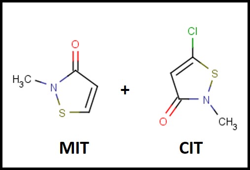
Fig 1. The chemical structures of the MIT and CIT molecules in the first isothiazolinone blend marketed as a microbicide for use in MWFs.

The 2020 Hazard Characterization of Isothiazolinones in Support of FIFRA Registration Review7

In April and May 2020, the U.S. EPA issued Registration Review Draft Risk Assessments for six isothiazolinones (Its). The CIT/MIT and MIT assessments were provided in one document, thus there were five risk assessment reports plus the hazard characterization. I have listed these in Table 1.

Table 1. U.S. EPA Isothiazolinone Draft Risk Assessments

Note a – DCOIT is not approved for use in MWFs. Consequently, I won’t mention it in the rest of this post.

Despite toxicological data to the contrary (have you read this phrase before?), EPA chose to evaluate all ITs together – based on their putatively similar structural and toxicological property similarities. The best news is that none of the IT-microbicides were found to be either carcinogenic or mutagenic. However, as a class, they were designated as Category I (corrosive) for eye irritation and Category I (corrosive) for skin irritation (except for BIT – which was classified as non- irritating – Category IV). Moreover, the risk assessments used results from laboratory studies to identify Points of Departure (POD) for inhalation and dermal health risks. A POD is a point on a substance’s dose-response curve used as a toxicological reference dose (see Figure 2). For the IT risk assessments, the POD was the LOAEL – the lowest observable adverse effect level).

Each risk assessment discussed the different types of exposure relevant to each IT end-use applications and types of users – i.e., residential handlers – adults and children, commercial handlers, machinists, etc. Exposures related to MWF-use were addressed as a separate category. For inhalation and dermal exposures, respectively level of concern (LOC) and margin of exposure (MOE) were considered. The isothiazolinone LOCs were their PODs. The MOE is the ratio of the POD to the expected exposure. If MOE ≤ LOC, it is considered to be of concern. If MOE > LOC, it is not of concern.


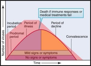
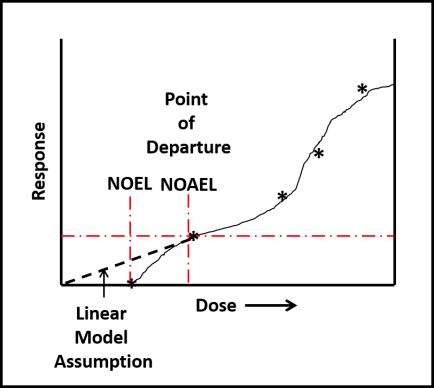
Fig 2. Toxicity test dose response curve. LOAEL is the lowest observable adverse effect level. NOEL is the no observable effect level. The linear model assumes that the NOEL is always at test substance concentration = 0. The biological model recognizes that most often NOEL is at a concentration >0. Dose can be a single exposure (for example, 1.0 mg kg-1 of test organism body weight) or repeated exposures (for example 0.1 mg kg-1 d-1). Response depend on what is being observed (skin irritation, lethality, etc.).

Isothiazolinone Inhalation MOEs

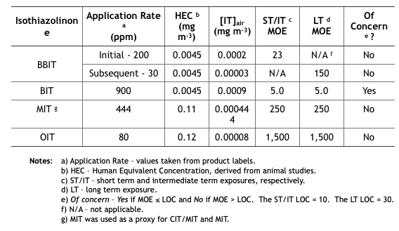
Table 2 summarizes the MWF inhalation MOE determinations from the five isothiazolinone (IT) risk assessments. These determinations are based on unsubstantiated assumptions.

  • First, IT concentrations in the air ([IT]air (mg m-3) were estimated based on EPA’s misunderstanding of how microbicides are used in MWF. EPA defined application rate as either initial treatment based on the maximum permissible dose as listed on the product’s label, and subsequent treatments as the minimum effective dose listed on the product label. These categories assume that all IT-microbicides are used only tankside and that subsequent treatments are driven by MWF turnover rates rather than biocide demand8. However, except for CIT/MIT, IT-microbicides are typically formulated into MWFs.
  • Next, [IT]air was estimated based on oil mist concentrations that had been measured at MWFs by OSHA during the years (2000 through 2009). During this period OSHA collected 544 air samples and computed the 8h time weighted average (TWA) oil mist concentration to be 1.0 mg m-3. The risk assessments did not provide a reference for the OSHA data, not did they indicate either the range of variability (standard deviation) of mist concentrations measured. Moreover – given that IT-microbicides are water-soluble, but not particularly oil-soluble – EPA’s use of oil mist concentration data was scientifically indefensible.
  • Compounding these two misperceptions, EPA calculated inhalation exposures by multiplying the assumed [IT] in the MWF by the average mist concentration. For example, if [MIT] in MWF is 444 ppm (mg IT L-1 MWF), then 444 ppm x 1.0 mg m-3 = 0.000444 mg m-3 (444 ng m-3, where 1 mg = 1,000,000 ng). As illustrated in Table 2, the short term (ST) and intermediate term (IT) inhalation exposure LOC for MIT = 10, and the long term (LT) LOC = 30.
  • Each IT’s MOE is computed from its 8h Human Equivalence Concentration (HEC – derived from animal toxicity data) and [IT]air: MOE = 8h HEC ÷ [IT]air (for MIT the HEC = 0.11 mg m-3 and [IT]air = 0.000444 mg m-3, so the MOE for MIT = 0.11 ÷ 0.000444 = 248, which rounds to 250). If you think this risk assessment seems to be based on an unacceptable number of assumptions, you are not alone.

Table 2. Risk Assessment Inhalation MOEs for Exposure to Isothiazolinone-Treated MWFs.

Isothiazolinone Dermal MOEs

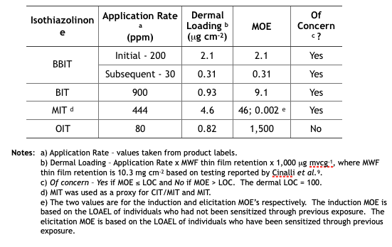
Table 3 summarizes the MWF dermal MOE determinations from the five isothiazolinone (IT) risk assessments. These determinations are based on the same unsubstantiated assumptions used to determine the inhalation MOEs.

Table 3. Risk Assessment Dermal MOEs for Exposure to Isothiazolinone-Treated MWFs.

Implications

Future Reregistration Eligibility Decisions (REDs) – as with triazine, EPA will use the risk assessments as the basis for the respective isothiazolinone (IT) REDs. The agency will most likely restrict end-use concentrations to levels that ensure Margins of Exposure (MOEs) are greater than Levels of Concern (LOCs). The only IT not likely to be affected is OIT. Its inhalation and dermal MOEs are in the not of concern range. In contrast, BIT’s inhalation and dermal MOEs are both of concern. We can anticipate that the EPA’s BIT RED will limit the maximum concentration in end-use diluted MWFs to a level that will ensure that both MOEs are greater than the respective LOCs. We can also anticipate that the maximum permitted BBIT, CIT/MIT, and MIT concentrations in end-use diluted MWFs to be reduced so that the dermal MOE is greater than the dermal LOC. With an elicitation MOE = 0.002 for CIT/MIT and MIT, it is possible that EPA will simply prohibit their use in MWFs.

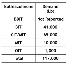
Economics – The 2012 Kline specialty biocides report10 projected that by 2017, 117,000 pounds of IT-microbicides would be used in MWFs in the U.S. (Table 4). In particular, BIT use has increased as a stand-alone microbicide and an active ingredient blended with one or more other active ingredients (for example BIT + triazine, BIT + sodium pyrithione, and BIT + bromo-nitro- propanediol – BNPD). The fate of these formulated microbicides could be affected by the new BIT RED.

Table 4 Projected, 2017, IT-Microbicide Demand for Use in MWFs (from IT product US EPA Risk Assessments).

If effective microbicides cannot be used to protect MWFs against microbial contamination a number of possible scenarios are likely to unfold. In the first, MWF functional life will be severely reduced. Systems that have been running for years without a need for MWF draining, cleaning, and recharging (D, C, & R), are likely to require D, C, & R multiple times per year. This will increase MWF and waste treatment/handling costs. In the second, MWF-compounders will modify their formulations to include molecules that are toxic but do not have pesticide registration. This potentially increased the health risk to machinists and other workers routinely exposed to MWFs. A third would be the increased use of biostable functional additives. The list of biostable functional products has grown substantially over the past two decades and is likely to accelerate as effective microbicide availability continues to shrink. Many currently available synthetic MWFs are quite resistant to microbial contamination. However, they are not suited to all metalworking applications. New applications research, using recently developed functional additives could close this applications gap. A fourth possibility is that MWF-compounders will try to adopt the intentional bioburden model used by one compounder. One MWF product line supports an apparently benign bacterial species whose presence seems to inhibit the growth of potentially damaging (biodeteriogenic) microbes. All of these scenarios translate to increased cost.

Health Issues – On countless previous occasions, I have discussed the potential health issues associated with uncontrolled microbial contamination (for my most recent paper – co-authored with Dr. Peter Küenzi – go to: tandfonline.com. There is some evidence that conventional mist collectors do not do a great job of scrubbing bioaerosols from plant air. MWF bioaerosols are whole cells and cell parts that come from the recirculating fluid and system surfaces. They cause or exacerbate allergenic and toxigenic respiratory disease. If MWF bioburdens cannot be controlled, MWF bioaerosols are likely to pose an increased worker health risk.

Problems with the U.S. EPA’s Isothiazolinone Risk Assessments and Call to Action

As I noted in my synopsis at the beginning of this post, the proposed risk assessment documents are open for comments until 10 November 2020. The U.S. EPA webpage provides instructions for how to submit comments to any or all of the risk assessment documents (dockets in EPA jargon).

Dr. Adrian Krygsman, of Troy has prepared talking points for industry stakeholders. I have previously had Dr. Krygsman’s talking points broadcast to ASTM E34.50 members and STLE metalworking fluids community members. I am copying it below in its original form:

* * *
Specific Comments on Metalworking Fluids:
U.S. EPA DRAFT RISK ASSESSMENTS: BIT-CMIT-OIT
Focal Points

A. General Comments on Approach:

  • According to EPA’s assessments there are concerns over the occupational risks associated with MWF’s due to inhalation and dermal exposure concerns. This is based on:
    • – Toxicological endpoints chosen for dermal and inhalation risk assessments (occupational and residential) are ultra conservative due to:
      • – Although there are separate databases for each IT EPA considers their overall response to be similar (corrosivity/irritation in sub-chronic studies) allowing them to interchange the most sensitive tox. Endpoints as needed per each individual assessment.
      • – Use of tox. Endpoints from other IT’s (e.g.- use of DCOIT inhalation threshold) for BIT.
      • – EPA uses a model to address spray mist levels of IT’s in air due to short term/intermediate term exposure.
      • – EPA addresses dermal exposure using their reliance on in-vitro/in chemico studies on IT’s. This approach, first validated in the EU for cosmetic products, using acute neural network approach and Repeated Open Insult Tests (ROAT) to set dermal thresholds for elicitation (that concentration which causes a skin reaction) and induction (period of time needed to induce a dermal allergic reaction). EPA is using an approach typically used for cosmetic products to create new thresholds for dermal exposure. Using this approach, no IT will pass their ultra conservative dermal exposure approach.
      • – EPA uses a dermal immersion model to conduct specific assessments for metalworking fluids.

B. Specific Comments

  • EPA has used maximum use rates in all of their assessments. Rates need to be checked.
  • EPA is misleading especially for CMIT/MIT by indicating 39 publicized adverse incidents. How many incidents of dermal rash or irritation are seen in the MWF industry?
  • Are the models EPA is using for MWF’s appropriate (e.g. dermal immersion model)?
  • EPA’s use of toxicological endpoints from other IT’s interchangeably. For example why choose DCOIT inhalation tox. Data for BIT? DCOIT is not a suitable surrogate for BIT. It is highly chlorinated versus BIT.
  • The IT Task Force is submitting human data to address EPA’s use of their non-animal data. Due to EPA’s reliance on this data they are obligated to account for intraspecies and interspecies differences (10X safety factors) resulting in a Margin of Exposure of 100X. Coupled with the low values obtained from their non-animal dermal studies it will be impossible to address dermal exposure effects, unless EPA validates this EU exposure approach before a scientific advisory panel (SAP). EPA considers their approach validated because experts in the EU have reviewed the approach and data. It has not been validated here.
  • The industry can not allow an assessment approach used for “leave-on cosmetics” to be used for regulation of industrial chemicals.
  • If PPE are incorporated into EPA’s assessments typical uses such as in-preservation of MWF’s still do not pass EPA’s dermal assessment. This is counter intuitive.
  • For CMIT/MIT EPA interchanges use rates of MIT at 400 ppm against CMIT/MIT values of 135 ppm.

C. Conclusion:

  • Major concerns have been raised for inhalation and dermal exposure from exposure to MWF’s. All IT’s assessed are problematic for these two routes of exposure. This is a function of EPA’s approach to group IT’s together and utilize an approach for dermal exposure which has never been used before.
  • The IT task force is combatting EPA’s approach for dermal assessment by submitting human sensitization data. This is the only way to show EPA this approach is wrong.
  • There are no concerns for environmental fate or ecotox. Effects.

Questions/Contact: Adrian Krygsman, Director, Product Registration
Troy Corporation
Email: Krygsmaa@Troycorp.com
Phone: 973-443-4200, X2249

* * *

Please send your comments and questions about this blog post to me at: fredp@biodeterioration-contol.com.

1 archive.epa.gov

2 IARC Monographs on the Evaluation of Carcinogenic Risks to Humans Volume 88 (2006), Formaldehyde, 2-Butoxyethanol and 1-tert-Butoxypropan-2-ol. https://publications.iarc.fr/106

3 Cohen, H.J. (1995), “A Study of Formaldehyde Exposures from Metalworking Fluid Operations using Hexahydro-1,3,5-Tris (2-hydroxyethyl)-S-Triazine,” In. J.B. D’Arcy, Ed., Proceedings of the Industrial Metalworking Environment: Assessment and Control. American Automobile Manufacturer’s Association, Dearborn, Mich., pp. 178-183.

4 Markku Linnainmaa, M., Hannu Kiviranta, H., Laitinen, J., and Laitinen, S. (2003), Control of Workers’ Exposure to Airborne Endotoxins and Formaldehyde During the Use of Metalworking Fluids, AIHA Journal 64:496–500.

5 Passman, F. J., (2010), Current Trends in MWF Microbicides. Tribol. Lub. Technol., 66(5): 31-38.

6 FIFRA – Federal Insecticide, Fungicide, and Rodenticide Act, 7 U.S.C. §136 et seq. (1996). https://www.epa.gov/laws-regulations/summary-federal-insecticide-fungicide-and-rodenticide-act

7 U.S. EPA (2020) Hazard Characterization of Isothiazolinones in Support of FIFRA Registration Review. https://beta.regulations.gov/document/EPA-HQ-OPP-2013-0605-0051

8 Biocide demand is the sum of all factors that decrease a microbicide’s concentration in a treated MWF. These factors include the microbes to be killed, chemical reactions with other molecules present in MWFs, evaporation (for volatile microbicide molecules), transport in MWF mist particles, drag-out, and dilution.

9 Cinalli, C., Carter, C., Clark, A., and Dixon, D. (1992), A Laboratory Method to Determine the Retention of Liquids on the Surface of Hands, EPA 747-R-92-003. https://nepis.epa.gov/Exe/ZyPDF.cgi/P1009PYK.PDF?Dockey=P1009PYK.PDF

10 Kline report: “Specialty Biocides: Regional Market Analysis 2012- United States” published April 3, 2013.

The Problem With Statistics – It’s Not The Statistics, But How We Abuse Them

Here’s a COVID-19 statistic – interpret it as you will…

A 23 June 2020 United Press International (UPI) headline in Health News (proclaims: “Less than half a population needs COVID-19 infection for herd immunity, study says.

The report goes on to state: “The modeling study found that herd immunity potentially could be achieved with about 43 percent of the population being immune, as opposed to the 60 percent estimate derived from previous models.” This is based on modelling work done by a member of the University of California-Riverside faculty. As I read the article my thoughts again turned to the observation about lies, damned lies and statistics (variously ascribed to Samuel Clemens, Benjamin Disraeli, and various other mid-19th century sources).

What population?

I’m not quibbling with the model used to compute the statistic, but do have an issue with how the article’s writer used it (note: having been misquoted on occasion, I cannot say that the statistic that appeared in the UPI article captured the cited investigator’s intent accurately. My issue is about granularity – the scale or level of detail present in a set of data or other phenomenon. I illustrate my point in figure 1. All of the images include New York City ranging from a satellite image (least granular) to an aerial photo of a single building on the northeast corner of 96th Street and 5th Avenue (most granular).

The 43 % statistic cited above is meaningless unless it incudes a statement about granularity. If applied globally, it ignores the possibility that in some countries, the majority of the population might be immune while in others, the percentage of immune individuals might be substantially less than the 43 % threshold for herd immunity. Moving across the granularity spectrum, will it be sufficient to consider 43 % immunity for an entire city, or will 43 % of the residents of each building need to be immune?


Fig 1. Granularity – moving from left to right, the images become more granular – provide a more detailed view of New York City.


Nowhere in the article was there any indication of the geographic area within which herd immunity would be achieved once 43 % of the population was immune to COVID-19. The result is a misleading article. Note that is possible to focus too closely on the details – as in missing the forest for the trees. My personal object lesson was having focused on a sea anemone (size ∼10 cm wide by 15 cm tall) while a whale swan directly over my head (figure 2 – not actual photos of the 1975 event). As I came out of the water, people asked if I had photographed the whale. I responded: “What whale?”


Figure 2. Missing the forest for the trees, or the whale for the anemone.


Herd Immunity and Physical Distancing

Guidelines from the Centers for Disease Control (CDC) and World Health Organization (WHO) indicate that we should maintain physical spacing of at least 6 ft (~2m) for other people to prevent transmission of the SAR-CoV-2 virus from communicable individuals to susceptible ones. If there are a group of people in a room – say a restaurant on a New York city block on which more than 43 % of the residents are COVID-19 immune – how will that affect physical distancing requirements? Based on the statistics cited in the UPI article, I have no idea. Apparently, nor does anyone else. There are simply insufficient data from which to draw an objective conclusion.

Statistics Abuse – There’s the Rub

There’s an old joke about a duck hunter who fires his shotgun twice at a duck flying overhead (figure 3). His first shot flies past the duck, ∼1 m ahead of the bird and the second misses by the same distance behind it. The hunter proclaimed that one average (the midway point between the two shots) the duck was killed – except that it wasn’t (note: no ducks were harmed in the retelling of this statistics tale). Statistics is a branch of mathematics that provides elegant tools for distilling large amounts of data into useable form. That’s the science. The art is in marrying statistical analysis to other observations and logical thinking. Statisticians are the first to caution users to recognizes that their calculations are always in the context of probabilities. What is the probability that an apparent pattern (relationship) is simply random? What is the probability that a seemingly random pattern hides an important relationship? What is the impact of interpreting the statistics incorrectly?


Fig 3. One average the duck was shot. Statistically, the average of two volleys, equidistant in front of and behind the duck, would result in a kill.


What does this all mean?

Since my last post in May, epidemiologists and other public health experts have been trying their best to refine models for risks related to exposure to SAR-CoV-2, contraction of COVID-19, and alternative measures for ending the pandemic. In that in that post, I discussed risk versus hazard and the concept of acceptable risk. Within our free society, some citizens believe exposure to SAR-CoV-2 is an acceptable risk and have decided that no precautions are necessary. Recent spikes in the morbidity rate (i.e., number of new cases per 100,000 people in a given area) have reflected the wisdom (better: lack thereof) of ignoring the imperfect science. Presumably, at some point in the next few months, populations in many areas of the U.S. will approach the percent immunity targets identified in the UPI article. At that point, the risk of non-immune individuals contracting the disease will fall to a level that elected officials and business leaders deem acceptable. Will they be right or is acceptable risk in the eyes of the beholder?

I’m writing this to stimulate discussion, so please share your thoughts either by writing to me at fredp@biodeterioration-control.com or commenting to my LinkedIn post. Also, on 29 July at noon, Eastern Daylight Time, Dr. John Howell, Dr. Neil Canter, Mr. Bill Woods, and I will participate in an STLE webinar panel discussion on COVID-19 risk in the machine shop work environment.

SARS-CoV-2 (Severe acute respiratory syndrome coronavirus 2 – the virus that causes COVID-19) persistence in metalworking fluids

Does the SARS-CoV-2 virus persist in Water-Miscible Metalworking Fluids?

Over the past two months, I have received quite a number of emails and phone calls asking if water-miscible metalworking fluids (MWFs) were likely to be a source of SARS-CoV-2 virus exposure for machinists and others working in machine shops.

My short answer is that nobody really knows. I know that this answer is not particularly reassuring, but the test methods needed to test MWFs and MWF mists for SARS-CoV-2 in there types of samples do not yet exist. For companies and institutions developing test methods to detect SARS-CoV-2 the first priority has been identifying infected individuals. Given that most transmission seems to be via inhalation of aerosol droplets that carry virus particles, and that the aerosols of primary concern are those produced when someone sneezes, coughs, or speaks, investigating virus persistence in fluids was initially considered to be a less critical need.

However, for those working in the manufacturing sector, there is a history of adverse health effects – primarily allergies – caused by MWF aerosol exposure. Also, COVID-19 can be transmitted by touching a SARS-CoV-2 contaminated surface (i.e., contaminating the hands with viruses) then bringing the hands to the face. The virus can then be inhaled or gain entry through the eyes. If SARS-CoV-2 persists in MWFs, then machinists whose hands are in contact with the fluid and who then touched their face are at increased exposure risk. Additionally, machinists handle the parts that are to be machined. According to the European Centre for Disease Prevention and Control, SAR-CoV-2 an persist on copper surfaces for up to 4h, cardboard for 24h, and plastic or steel surfaces for up to three days. This means that there are ways COVID-19 can be transmitted at metalworking facilities.

Can we reasonably use what we know to assess the risk?

I believe that we can use the guidance provided by the Centers for Disease Control, (CDC) to minimize the incremental risk to machinists. Note that I am addressing incremental risk – that is the risk over and above our risk of contracting COVID-19 from our other activities. We are all at risk, however, all of the epidemiological studies that have been reported to date agree that social distancing reduces risk. To understand the incremental risk, we need to understand a few concepts:

Risk

Risk is a function of hazard + exposure (R = H + E – Figure 1). This means that the most hazardous substance poses no risk if exposure is zero. All of the clinical and epidemiological studies that have been published since the first reports of COVID-19 in Wuhan, China last November indicate that SARS-CoV-2 virus is quite hazardous. Although the number of virus particles needed to cause a COVID-19 infection is not known, the ease with which the disease spreads from infected individuals to susceptible victims, the severity of many non-lethal infections, and apparent mortality rate (percentage of people who have contracted clinically reported infections and who ultimately die from the disease) demonstrate that SARS-CoV-2 is hazardous. Consequently, until a SARS-CoV-2 vaccine is developed, the primary means of reducing disease risk is isolation.

Fig 1. Venn diagram illustrating the relationship between hazards, exposure, and risk.

In many respects, the risks encountered at manufacturing facilities are identical to those related to the general population’s activities. For example, most people walk outdoors, handle doorknobs, groceries, appliances (computer, TV, smart phones, etc.), and generally expose themselves in countless ways. As depicted in Figure 2, this (blue ellipse) is our non-MWF facility exposure. For those who work at manufacturing facilities, there is some incremental exposure (red ellipse in Figure 2). Note, this is not to scale. We do not know the actual incremental risk.

Fig 2. Venn diagram illustrating incremental exposure of machinists and others at metalworking facilities.

Acceptable Risk

Risk is an objective concept. You can compute it if you know the hazard and the exposure (direct contact). Acceptable risk is purely subjective. The chances of dying in a plane crash are 1 in 11 million (0.000009 %) and of dying in a bathtub are 1 in 840,000 (0.0001 %). However, fear of flying represents an unacceptable risk to more people than fear of bathing does. Throughout the world today, we see the impact of differing opinions regarding risk acceptability playing out. At one extreme, people have placed themselves in complete isolation. At the other, people are ignoring all COVID-19-related personal hygiene and social distancing guidance. There is no broad consensus on the appropriate balance between measures to reduce the exposure risk and those taken to sustain the economy. One both sides of the argument, hysteria tends to take precedence over objective risk assessment. Intelligent, honest people can reasonably disagree on what constitutes an acceptable SARS-CoV-2 exposure risk. I will steer clear of that argument here but will note that as the COVID-19 pandemic has illustrated, risks rarely exist in isolation. Reducing one risk can easily increase another risk. In the case of COVID-19, decreasing the disease risk has increased the poverty risk for many people.

Viruses

Viruses are sub-microscopic (i.e., can been seen through an electron microscope but are too small to be seen through a light microscope – as seen in Figure 3, viruses are ∼0.001 times the size (volume) of bacteria and ∼0.000001 times the size of human cells). They contain genetic material enveloped in a coat. More than 6,000 different viruses have been identified (no doubt a tiny fraction of the different types of viruses that exist). Some – including SARS—CoV-2 – contain ribonucleic acid (RNA) and others contain deoxyribonucleic acid (DNA) as their genetic material. Virus coats can be protein or protein and lipid (Figure 4 shows the SARS-CoV-19 structure). Viruses can persist (i.e., remain infectious) but cannot multiply outside of susceptible (host) cells. Most viruses can only attack specific types of cells. The infection process starts with one or more viruses attaching to sites on the host’s cell wall. For SARS-CoV-2 viruses, the spike protein attaches to a cell. The virus then injects its genetic material into the host cell and the virus’ genes hijack the host cells’ genes – redirecting them to produce new viruses. Once the host cell is full of newly manufactured virus particles, it breaks open (lyses) to release the viruses into the environment surrounding it. If there are no susceptible cells to infect, a virus will eventually decompose. This is the basis for the persistence testing. When 3 days persistence is reported, that means that although the number of infectious viruses is decreasing from the moment they are deposited onto a surface, it takes 3 days for the number has decreased to below the test method’s detection limit (the detection limit is the minimum number/value that can be measured by a given test method).

Fig 3. Size scale – atoms to frog eggs.

Fig 4. SARS-CoV-2 virus schematic. A complex coat encapsulates the virus’ RNA.

Detecting viruses

Viruses are cultured by inoculating a layer of susceptible cells (i.e., a tissue culture) with a specimen containing viruses. As they infect the tissue culture cells, the viruses create clear zones – plaques – each of which contains billions of individual virus particles – virions (Figure 5). Viruses isolated by culture testing can then be used to develop other test methods. The most common methods are immunoassays (detect the presence of antibodies to specific viral antigens) and genetic tests (see my January 2018 What’s New posts for more detail explanations of antigen and genetic test methods).

At present the lower detection limit for SARS-CoV-2 virions is ∼2,700. A sneeze droplet from an infected person can carry millions of virions. That makes it relatively easy to detect the virus on contaminated surfaces or on a nasal swab sample. If that same sneeze droplet lands in 1 mL of fluid, the number of virions in that droplet are diluted 50,000-fold. As the ratio of the fluid volume into which someone has sneezed, coughed, etc. increases, so does the dilution factor and the difficulty of detecting viruses in the contaminated fluid. Consequently, to be detected in fluids (water, MWF, etc.) virus particles must first be concentrated. This concentration step is easier with fluids that have few contaminants (for example, potable water) than with complex, contaminant loaded fluids like MWFs. Consequently, it might be months or years before methods are developed to detect and quantify SARS-CoV-19 virus particles in MWFs.

Risk Assessment

Clearly, without data, assessing the risk of COVID-19 infection due to exposure in metalworking facilities is an exercise in speculation. However, because of the pandemic-related epidemiological studies that have been done for the general public and at food processing facilities, there is a basis for an educated guess.

Bioaerosol Exposure

Social distancing is the most effective way to reduce exposure. The general CDC guidelines apply equally well to personnel working in machine shops. Although mist collection systems have reduced MWF mist exposure, and the incidence of reported clusters of industrial asthma and other respiratory diseases has plummeted since the 1990s, when mist collection systems were installed at many metalworking facilities, there remains some question about how well mist collectors capture sub-micron diameter, bioaerosols. It is likely that there remains some risk of bioaerosol exposure, but there are insufficient data to define that risk. Generally speaking, recirculating MWFs act as bioaerosol reservoirs (i.e., the source) and MWF system biofilms act as MWF microbial contamination reservoirs. There have not been any reported studies of virus loads in MWF aerosols or virus presence or persistence in MWFs, so it is difficult to predict SARS-CoV-19 persistence in MWFs.

Some studies have been done to evaluate the COVID-19 risk to wastewater treatment plant operators. It has been reported that SARS-CoV-19 can persist for “2 days at 20°C, at least 14 days at 4°C, and survive for 4 days in diarrheal stool samples with an alkaline pH at room temperature.” (source: https://www.waterra.com.au/_r9550/media/system/attrib/file/2200/WaterRA_FS_Coronavirus_V11.pdf). Given that MWFs are alkaline and that the temperature of recirculating MWFs typically ranges between 30 °C (86 °F) and 37 °C (100 °F) it is likely that the virus will persist for 2 to 7 days in MWFs. Consequently, there is a risk that workers can be exposed to virus particles in MWF mist droplets.

Contact exposure

As noted above, the SARS-CoV-2 virus can persist on steel surfaces for up to 3 days. Consequently, handling parts that have become contaminated with virus particles within the previous 3 days poses an infection risk.

Risk Mitigation

Social distancing

Workers are typically standing shoulder to shoulder at food processing facilities where COVID-19 clusters have been reported. The distance between machines at metalworking facilities is more conducive to social distancing. Keeping at least 1.8 m (6 ft) distance between workers substantially decreases the risk of transmission among workers.

Mist control

Reduced mist exposure translates to reduced risk. If enclosures remain closed for at least 30 sec after MWF fluid flow is stopped, then the risk of mist inhalation decreases substantially. Equally important is mist collection system maintenance. To operate effectively, mist traps and reservoirs must be kept clean. Their surfaces should be disinfected after each leaning. High-efficiency particulate air (HEPA) filters installed at mist collect exhausts must be changed with sufficient frequency to prevent filters from becoming a source of bioaerosol exposure. Effective facility ventilation – including air flow and relative humidity control – will reduce virus persistence.

Personal protective equipment (PPE)

The role of appropriate PPE, properly worn and maintained, in preventing respiratory disease and dermatitis has been well documented. Workers likely to be exposed to MWF aerosols should wear air filtration masks that will prevent virus inhalation (i.e., meet or exceed capabilities of N-95 masks). Other masks help to remind individuals not to touch their face and trap aerosol droplets that they produce but do little to prevent them from inhaling virus particles that are in the air. Non-porous gloves can prevent direct contact with viruses that are on part surfaces. However, surgical gloves are likely to tear quickly when used to handle tools, machines, and parts. Recognizing that SARS-CoV-2 particles can persist on glove surfaces for several days, it is important to disinfect gloves with a hand sanitizer before removing them.

Personal hygiene

It seems that a substantial percentage of people with COVID-19 infections never show symptoms. However, these individuals can infect others. Effective personal hygiene practices can mitigate the disease transmission risk. Effective measures, as detailed by the CDC (see link above) include keeping hands away from the face and washing hands frequently – after each time a person touches any surface that might be contaminated with the SARS-CoV-19 virus. Applying a hand sanitizer can be an effective alternative to constant washing. The standard metalworking facility personal hygiene practices that have been advocated for decades also apply here. Workers should wear clean shop clothes. Street cloths should no be worn in the metalworking facility and work cloths should be cleaned by an industrial laundry service. Personnel should not eat, drink, or smoke before having washed hands thoroughly. Individuals should wash hands both before and after using the lavatories.

Bottom Line

Because workers are exposed to MWFs and parts, there is some incremental risk of SARS-CoV-2 exposure associated with working at metalworking facilities. Given that in contrast to food processing facilities there have been no reported COVID-19 clusters at machine shops, the incremental risk is likely to be small. Still, there are steps that owners, managers, and workers can take to minimize workplace-related incremental risk. Taking these measures can help maintain productivity while protecting workers from unnecessary COVID-19 risk. From the moment of birth to the moment of death, our lives are risk-laden. It is impossible to reduce risk to zero. However, by remaining mindful of potential sources of exposure and taking precautions to avoid bioaerosol inhalation, metalworking industry stakeholders can minimize the risk of workplace exposure.

Stay safe, productive, and healthy! Please send your comments and questions to me at fredp@biodeterioration-contol.com.

OUR SERVICES

  • Consulting Services
  • Condition Monitoring
  • Microbial Audits
  • Training and Education
  • Biocide Market Opportunity Analysis
  • Antimicrobial Pesticide Selection

REQUEST INFORMATION


    captcha