Archive for the ‘Uncategorized’ Category


COMPARING MICROBIOLOGICAL TEST METHODS – PART 4


The tool you choose depends on the intended use.

Parts 1 Through 3 Recap

In Part 1 (July 2021), when I started this series on test method comparison, I provided an overview of several basic precision concepts:

  • Accuracy
  • Bias
  • Correlation coefficient
  • Regression curve
  • Repeatability
  • Reproducibility

In Part 2 (August 2021) I explained why it is unrealistic to expect correlation coefficients between two methods, each based on a different parameter (e.g., CFU mL-1 and gene copies mL-1) to be as strong as the correlation between a test parameter and dilution factor. I continued that discussion in Part 3 (September 2021) and elaborated on the concept of attribute score agreement. In this month’s article I’ll provide some sensitivity training.

Conversion Charts

Many manufacturers of test kits use to measure parameters other than culturability (i.e., CFU mL-1) feel compelled to provide conversion charts. I have lost count of the number of emails and phone calls I’ve fielded from test kit users who are wondering why the results of a non-culture test method don’t agree with their culture test results. Most often, the person with the question has used a conversion chart (or equation) to convert parameter X to CFU mL-1.

Conversion charts are meant to be helpful. Non-culture test manufacturers are concerned that in order to embrace new technology, users must be able to convert all microbiological test results to CFU mL-1. First, I believe the test kit manufacturers who provide conversion tables underestimate theory customers’ intelligence. In my opinion, such tables create confusion. Worse, they too often cause users to distrust the data they are obtaining with the non-culture test method. Conversion charts are created based on two assumptions:

1. The correlation coefficient between the non-culture method and culturability will be >0.9, and
2. The relationship between CFU mL-1 and the parameter measured by the non-culture method will never vary.

By now, everyone who has read Parts 1 through 3 recognizes that it is unrealistic to assume that either of these assumptions has any basis in reality. My advice is to ignore any conversion chart that comes with a test kit. Instead, use the recommended categorical designations (i.e., wording similar to negligible, moderate, and heavy microbial contamination), as explained in Part 2. More on this later.

Testing Field (i.e., Actual) Samples

The most appropriate way to compare two microbiological test methods is to run them both on actual samples. The more samples tested by both methods, the better. Minimally, the data set should have non-negative results from 50 samples. Results are non-negative if they are greater than the method limit of detection (LOD). Obtaining non-negative results from 50 samples can be challenging in applications where the action level and LOD are the same. In applications where >90 % of all samples have below detection limit (BDL) microbial contamination, >1000 samples might need to be tested in order to obtain 50 non-negative data pairs. I’ll use ATP testing by ASTM D4012 and culture testing to illustrate my point.

Consider a deionized water (DIW) system for which the culture test control limit/action level = 100 CFU mL-1 (this is the LOD for commonly used paddle – dipslide – tests). The 100 CFU mL-1 control limit was set because that was the method’s LOD. The LOD for ASTM D4012 is 0.1 pg cATP mL-1 (1 pg = 10-12 g). Now assume:

1. Culture testing detects approximately 1 % of all of the viable microbes in an environmental sample (depending on the sample, the microbes, and the details of the culture test method used, recoveries can range from 0.01 & to >10 %), and.
2. The average cATP cell = 1 fg (1 fg = 10-15 g). Although the [cATP] per cell can range from 0.1 fg cell-1 to 100 fg cell-1, >60 years of environmental sampling indicate that an average of 1 fg cell-1 is a reliable estimate of the relationship between ATP-bioburden and cells mL-1.

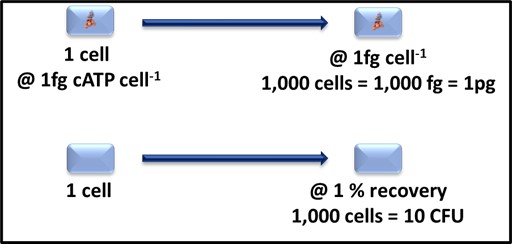
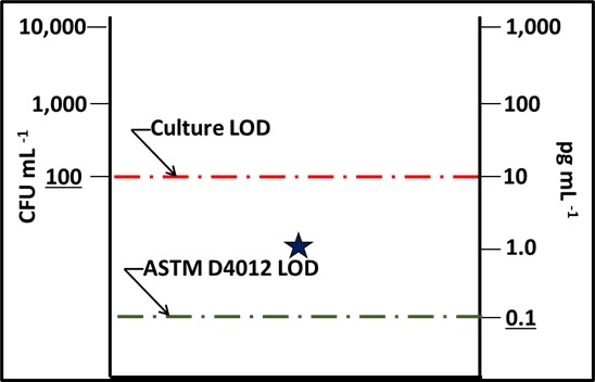
Note here, I am not recommending that either the 1% value for CFU mL-1 or 1 fg cell-1 be used routinely to convert test data to cells mL-1. I am using these vales only to define detection limit expectations. As Figure 1 illustrates, a 1 mL sample containing 1,000 cells is likely to translate into [cATP] = 1 pg mL-1 (where [cATP] is the cellular ATP concentration in the sample) and 10 CFU mL-1. Based on the LODs I’ve reported above, the ASTM D4012 result will be 10x the LOD and the culture test result will be


Fig 1. Relationship between cATP 1,000 cells-1 and CFU 1,000 cells-1.


Fig 2. Impact of detection limit (LOD) – star is the test result from a 1,000 cells mL-1 sample. The culture test result was BDL and the ASTM D4012 ([cATP]) result was 1 pg mL-1. The dashed lines indicate the limits of detection for culturability (red) and ASTM D4012 (green).

This LOD difference indicates that there are likely to be samples for which the [cATP] is measurable, but CFU mL-1 is not. This means that D4012 is more sensitive (has a lower LOD) than the culture paddle test.

Now we will look at the results from fifty samples. The LOD for culture testing (LODCFU) is 100 CFU mL-1 (2Log10 CFU mL-1), and the LOD for ATP testing by D4012 (LODATP) is 0.1 pg mL-1 (-1Log10 pg mL-1). Figure 3a is a plot of the Log10 CFU mL-1 (red circles) and Log10 [cATP] data (black triangles). The culture test results are ≥ LODCFU for only 12 of the 50 samples (24 %) and > LODCFU for 8 samples (16 %). However, all of the ATP results are > LODATP. Despite this disparity, the overall correlation coefficient, r = 0.88 (Figure 3b).


Fig 3. ATP and culture data from 50 samples – a) Log10 data versus sample ID; b) Log10 [cATP] versus Log10 CFU mL-1 showing two clusters: one of ATP < LODCFU and one of both ATP & CFU > their respective LOD.

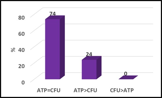
Perhaps more significant was the fact that although the respective patterns of circles and triangles seem quite different in Figure 3a, if the raw data are converted to attribute scores (see What’s New August 2021), the two parameters agree quite well (Figure 4). Typical of two-parameter comparisons the ATP and culture data yielded the same attribute scores for 74 % of the samples. In this data set, the ATP-based attribute scores were greater than the culture-based scores for the remaining 26 % of the samples. This indicates that the ATP test gave a more conservative indication of microbial contamination. This illustrates why – when comparing tests based on two different microbiological parameters – it is important to run both test methods on a large number of samples. Running tests on serial dilutions of a single sample is likely to underestimate the sensitivity (i.e., LOD) of one of the two methods.


Fig 4. Attribute score comparison – [cATP] (ASTM D4012) versus culture test. Numbers at the top of each column are percentages.

As always, I look forward to receiving your questions and comments at fredp@biodeterioration-control.com.

COMPARING MICROBIOLOGICAL TEST METHODS – PART 3

The tool you choose depends on the intended use.


Agreement

In August, I discussed the concept of attribute score agreement between two test parameters. Before continuing to the next part of my discussion, I’ll use a Venn diagram to further illustrate this concept. Figure 1 shows the respective data sets obtained by two test parameters – ATP-bioburden and culturable bacterial bioburden (bacterial CFU mL-1). The blue and red circles, respectively, represent the ATP and culturable bacteria data sets. The green zone is the region in which the data from the two parameters agree. In this illustration, the green zone indicates that there is 81 % agreement between the two parameters (these data are from a 2015 study that compared metalworking fluid data obtained from ASTM Test Method E2694 and those obtained by culture testing). Generally speaking, >70 % agreement is considered to be excellent. However, the decision to accept data based on one parameter as a proxy for data based on a different parameter is ultimately a management decision.

Fig 1. Venn diagram – attribute score agreement between two different metalworking fluid microbiological parameters, AT P and CFU mL-1.

As I have stated repeatedly in my previous What’s New articles, all microbiological test methods have both advantages and disadvantages relative to other methods. Generally speaking, I personally prefer fast, accurate, and precise molecular microbiological methods (MMM) such as ATP by ASTM Test Methods D4012, D7687, and E2694, over culture testing for field surveys (BCA’s Microbial Audits) and condition monitoring, but prefer culture test methods when I am trying to isolate and characterize specific microbes.

Test Method Comparisons – Extinction Dilution

Test Method Range

Extinction dilution testing is performed to assess a test method’s linearity along a range of values, its limit of detection (LOD), and its limit of quantification (LOQ). Both LOD and LOQ are indicators of tes method sensitivity. Sensitivity increases as LOD and LOQ decrease. Figures 2 and 3 illustrate these three aspects of test data. In Figure 2, light absorbance at 620 nm (A620nm) is plotted as a function of Log dilution factor (Log DF).

The LOQ, is the lowest concentration at which the test method gives a signal that is statistically different from the test results obtained with blank control specimens. In Figure 3, A620nm cannot detect cells present at densities <2.8 Log cells mL-1. The LOQ is the level above which results can be reported with some level of confidence. Typically, the LOQ = 10x the standard deviation of replicate test results obtained at the LOD. Table 1 shows the results of five replicate A620nm tests run on specimens from the 8.5 Log DF. The standard deviation (s) is 0.008. Therefore, the LOQ for A620nm = 0.08 (per Figure 3, this correlates with 3.4 Log cells mL-1).

Test results within a method’s linear range approximate a straight line (the equation is y = mx + b, where y is the controlled variable, x is the uncontrolled – measured variable, m is the line’s slope, and b is the line’s y-intercept – in Figure 2, Log DF = 7.5A620nm + 2.7). Because A620nm = 1 when 100 % of the incident light is absorbed, the relationship between A620nm and cells mL-1 is no longer linear at cell population densities of ≥10Log cells mL-1. Thus, the linear range for A650nm is 0.08 to 1.0.

Fig 2. Plot of A620nm versus Log DF, illustrating LOD, LOQ, and linearity range.

There are methods whose results have consistent, higher order relationships with the analyte concentration. As with methods that have linear relationships, there is a definable analyte concentration range within which the relationship applies. Data outside that range should be interpreted with caution.

When test results are greater than the maximum value within the linear range, the sample should be diluted as needed so that the results are within the range. For example, for culture testing, the LOQ is 30 colonies per 100 mm diameter Petri dish. Optimally, counts between 30 and 330 colonies (i.e., reported as colony forming units – CFU) are used to determine CFU mL-1. Petri plates with more than 330 colonies are typically reported as too numerous to count – TNTC, or confluent (when colonies for a continuous lawn) as illustrated in Figure 4. Two colonies on a plate (Figure 4a) is >LOD but 1010 CFU mL-1. In both cases, 109 or 1010 dilution factors were needed to obtain plates with 30 to 300 colonies.

Table 1 Using light absorbance (A620nm) to measure cell population density (cells mL-1) in suspension – variability at the LOD.

Fig 3. Plot of A620nm versus Log cells mL-1, illustrating LOD, LOQ, and linearity range.

Fig 4. Bacterial colonies on nutrient media in Petri plates – a) 2 CFU – the number of CFU > LOD but < LOQ; b) 42 CFU – the number is > LOQ and within the recommended range for counts per plate; d) TNTC – although the number of CFU per 1 cm x 1 cm square can be counted and used to compute the CFU per plate, this practice is not recommended; d) confluent growth the margins of individual colonies have merged to form a confluent lawn.

Parameter Comparisons

Test method users commonly confuse comparisons between two test methods that purport to measure the same parameter and those between test methods that measure different parameters. In Comparing Methods Part 1, I used metalworking fluid concentration ([MWF]) to illustrate the former. In this example, both acid-split and refractive index are used to measure the same parameter – [MWF].

Dilution series – When comparing two different microbiological test methods such as culturability (CFU mL-1) and ATP-bioburden ([cATP] pg mL-1), we are interested in correlation (i.e., the correlation coefficient (r)) or agreement. However, this correlation curve should not be used to assess the respective LOD and LOD of the two methods being compared. Consider an undiluted sample with culturable bacteria bioburden = 108 CFU mL-1 (8 Log CFU mL-1) and [cATP] = 105 pg mL-1 (5 Log pg mL-1). Figure 5 shows that the correlation coefficient between the two parameters is 1. However, the ATP test method LOD appears to be three orders of magnitude greater than that for the culture test – i.e., the culture test seems to be three orders of magnitude more sensitive than the ATP test.

Fig 5. Single sample dilution series comparing ATP and culture test results.

However, the apparent insensitivity of the ATP test is an artifact of the test protocol. One should expect to recover CFU in the 107 or 108th dilutions of a sample with 108 CFU mL-1 in the original sample, but to be unable to detect ATP at dilutions >105.

Field samples – when field samples are used to compare two parameters, the data provide a more accurate indication of their relative sensitivities. In figure 6, data are shown for undiluted samples tested for [tATP] and culturable bacteria recoveries. Now it is apparent that the ATP parameter is able to detect bioburdens that are below the LOD for the culture test method. I’ll not here the LOD and LOQ for culture tests can be lowered by using membrane filter methods. Membrane filtration protocols start with filtration of 10 mL to 1,000 mL of sample. For a 1,000 mL sample the LOD is 0.001 CFU mL-1 and the LOQ is 0.03 CFU mL-1. Similarly, the sensitivity of filtration-based ATP tests can be increased by increasing the volume of specimen filtered. Sensitivity can also be increased by using more concentrated Luciferin-Luciferase reagents.

Fig 6. ATP and culture test data from multiple field samples.

Bottom Line

Dilution curves like the one shown in Figure 5 are appropriate to assess whether two parameters correlate with one another but should not be used to compare their relative sensitivities. Twp parameter test result comparisons from field samples – as illustrated in Figure 6 – are suitable for assessing both correlation and relative sensitivity. In my next article I’ll explain how to use apply test method comparison data to set control limits.

As always, I look forward to receiving your questions and comments at fredp@biodeterioration-control.com.
COMPARING MICROBIOLOGICAL TEST METHODS – PART 2

The tool you choose depends on the intended use.

A Bit More About Relative Bias

In my last post I introduced the concept of relative bias. I wrote that unless there is a reference standard against which a measurement can be compared, only relative bias – the difference between test results obtained by different methods – can be assessed. In my example, I compared the results of two test methods for determining the concentration of end-use diluted metalworking fluids (MWF). Before moving on to comparisons among methods that measure different properties, I’ll share another illustration to show how relative bias differs from bias. In figures 1 a & 1b (figure 1 in July’s What’s New article) bias can be measured as the distance between the average value of the respective data clusters (yellow dots) and the bullseye’s center. However, in figure 1c, there is no target or bullseye – no reference point against which to assess the two data sets for their respective biases. In situations like this, we can only calculate the direction and magnitude between the two data clusters – the relative bias between the two methods. We cannot use these data to assess which method is more accurate.

Fig 1. Bias and relative bias – a) dots clustered around bullseye illustrate a high degree of accuracy (minimal bias – distance from target’s center); b) the tight cluster of dots illustrates good precision, but inaccurate results; (considerable bias – distance from target’s center); c) without a target or bullseye, only the relative bias – the direction and distance between the two data clusters – can be determined.

Comparing Two Different Parameters

Culture test fundamentals

Figure 2 from my July 2017 article illustrates the basic principle of culture testing. A nutrient medium is inoculated with a specimen and incubated under a standard set of conditions (i.e., temperature and atmosphere). Those microbes that can use the nutrients provided, under the incubation conditions used (for example, aerobic bacteria require oxygen, but anaerobic bacteria will not proliferate – multiply – unless the atmosphere is oxygen-free) will reproduce. Generation time is the period that lapses between cell divisions. For most known bacteria, generation times range from ∼15 min to ∼8 h. Typically, colonies (cell masses) become visible only after ∼109 (1 billion) cells have accumulated. This equals 30 generations (230). Thus, the time needed for a single cell to produce a visible colony can vary from 7.5 h ((30 generations x 0.25 h/generation) to 10 days (30 generations x 8 h/generation = 240 h = 10 d). Microbes that cannot proliferate under the test’s conditions remain undetected. Additionally, in specimens with microbes that have a range of generation times, the colonies of microbes with longer generation times are likely to be eclipsed by those of microbes with shorter generation times (figure 3). These two factors contribute to bioburden underestimations.

Fig 2. Microbe proliferation from individual cell to visible colony.

Fig 3. Colony formation on nutrient medium – a) fast growing (generation time = 45 min) microbe’s colonies are visible with 2 d; b) the rate at which colony diameters increase is proportional to the microbe’s growth rate; c) by 10 d, the individual colonies have merged for form a zone of confluent growth; d) slower growing (generation time = 4 h) microbe’s colonies are not yet visible at 2 d; e) these colonies first become visible after 5 d if they are not underneath faster growing microbe’s colonies; f) slower growing microbe’s colonies are plainly visible by 10 d, but only if they are not underneath confluent slower growing microbe’s confluent colony.

Chemical test fundamentals

Chemical tests include a variety of methods that detect specific microbial molecules. For example, quantitative polymerase chain reaction (qPCR) test methods detect the number of copies of specific genes. The results are reported as gene copies per mL (GC mL-1). Adenosine triphosphate (ATP) tests measure the number of photons of light emitted by the reaction of the enzyme luciferase with the substrate luciferin (see What’s New, August 2017 We know that organisms typically have multiple copies of various genes, and that the number of copies of a given gene varies among microbes with that gene. Similarly, we know that the number of ATP molecules varies among types of microbes (figure 4a) and organisms’ physiological states (figure 4b). Despite this, both qPCR and ATP data generally agree with culture test data and other chemical tests for bioburden.

Fig 4. ATP concentration per cell – a) ATP cell-1 varies among different microbes; and b) ATP cell-1 is greatest in metabolically active cells and least in dormant cells.

Although the [cATP] per bacterial cell is nominally 1 fg cell-1 (1 x 10-15 g cell-1), it can vary from 0.1 fg cell-1 to 50 fg cell-1, depending on the bacterial species present and whether they are healthy or stressed. I find it quite remarkable that despite the [cATP] per cell range, >60-years of studies on ATP-bioburden support the use of 1 fg cell-1 as a suitable basis for estimating ATP-bioburdens in many different types of samples.

Correlation coefficients

When comparing two different microbiological test methods such as culturability (CFU mL-1) and ATP-bioburden ([cATP] pg mL-1), we are interested in correlation (i.e., the correlation coefficient (r)) or agreement.

In last month’s What’s New article, I introduced the concept of correlation coefficient. The correlation coefficient (r) is the most common statistical tool for determining the relationship between two parameters. The value, r, can range from -1.0 to +1.0. The closer r comes to either +1.0 or -1.0, the stronger the relationship between the two parameters. If r’s sign is negative one parameter’s value increases as the other’s decreases. This is called a negative or inverse correlation. In Comparing Microbiological Test Methods – Part 1, figure 5 illustrated the relationship between two test methods used to determine water-miscible metalworking fluid concentration ([MWF]) at various end-use dilutions. The slope of the correlation curve ≈1 and r = 1.0 – indicating that for the MWF tested, the results obtained by acid split and refractometer reading agreed perfectly at the 95 % confidence level.

Contrast that plot with figure 5, below – a series of 10-fold dilutions of a sample that has 5.5 Log10 CFU mL-1 (3.2 x 10⁵ CFU mL-1) you should get a regression curve that looks like the one in figure 5 (July’s figure 5). In this graph r ≈ -1.0 – showing an inverse relationship between dilution factor and CFU mL-1.

Fig 5 Regression curve – culturable bacteria recovery (Log10 CFU mL-1) versus dilution factor.

When r = 0, there is no relationship between the parameters. Figure 6 is a plot of CFU mL-1 versus sample volume. In this example, r = 0.022 ≈ 0. As expected, CFU mL-1 values do not vary with sample volume.

Fig 6. Regression curve – culturable bacteria recovery (Log10 CFU mL-1) versus sample volume.

The critical value of r is the value at or above which the relationship between two parameters is statistically significant at a predetermined confidence level. The most commonly used confidence level is 95 % (α = 0.05). This means that there is a 5 % chance that a correlation will be interpreted as being statistically significant, when it isn’t (in statistics, this is known as a type I error).

The minimum value of r that is considered to be statistically significant (rcrit; α = 0.05) decreases as the number of samples tested (n) increases. For example, when n = 10, rcrit; α = 0.05 = 0.63, but when n = 100, rcrit; α = 0.05 = 0.20.

An assessment of the strength of the correlation between two parameters depends on what you are measuring. In many fields, correlations are categorized as strong, moderate, weak, or non-existent. However, the thresholds vary. Without consideration of the value of n, the categories can be misleading. That said, in general r > 0.75 is typically considered to indicate a strong relationship. Moderate relationships are indicated when 0.50 < r ≤ 0.75, and weak relationships are indicated when 0.25 < r ≤ 0.50. As used here, the terms strong, moderate, and weak are categorical – they identify categories of r-values.

Agreement between methods – attribute scores

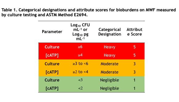
In industrial process control microbial bioburdens are typically classified into two or three categories based on control limits. For example, in MWF systems, culturable bioburdens <103 CFU mL-1 (<3Log10 CFU mL-1) are considered negligible, ≥103 CFU mL-1 to <106CFU mL-1 are moderate, and ≥106 CFU mL-1 are heavy. Negligible, moderate, and heavy are categorical designations. To facilitate computations, categorical designations are typically assigned numerical values – attribute scores. Table 1 lists the categorical designations and attribute scores for culture test and ASTM E2694 cellular ATP [cATP] in water-miscible MWF. Note that assignment to categories is a risk management decision that reflects the need to strike a balance between costs associated with microbial contamination control and those associated with fluid failure. That’s a topic for a future What’s New article.

In my next article – Comparing Microbiological Methods – Part 3 – I’ll apply the concepts I’ve explained in this article to actual test method comparisons.

I look forward to receiving your questions and comments at fredp@biodeterioration-control.com.
BIODETERIORATION ROOT CAUSE ANALYSIS – PART 4: CLOSING THE KNOWLEDGE GAPS

Refresher

In my March 2021 article, I began a discussion of root cause analysis (RCA). In that article I reviewed the importance of defining the problem clearly, precisely, and accurately; and using brainstorming tools to identify cause and effect networks or paths. Starting with my April 2021 article I used a case study to illustrate the basic RCA process steps. That post focused on defining current knowledge and defining knowledge gaps. Last month, I covered the next two steps: closing knowledge gaps and developing a failure model. In this post I’ll complete my RCA discussion – covering model testing and what to do afterwards (Figure 1).

Fig 1. Common elements shared by effective RCA processes.

Step 7 Test the Model

As I indicated at the end of May’s post , the data and other information that we collected during the RCA effort led to a hypothesis that dispenser slow-flow was caused by rust-particle accumulation on leak detector screens and that the particles detected on leak detector screens were primarily being delivered with the fuel (regular unleaded gasoline – RUL) supplied to the affected underground storage tanks (UST).

Commonly, during RCA efforts both actionable and non-actionable factors are discovered. An actionable factor is one over which a stakeholder has control. Conversely, a non-actionable factor is one over which a stakeholder does not have control. Within the fuel distribution channel, stakeholders at each stage have responsibility for and control of some factors but must rely on stakeholders either upstream or downstream for others.


For example, refiners are responsible for ensuring that products meet specifications as they leave the refinery tank farm (Figure 2a – whatever is needed to ensue product quality inside the refinery gate is actionable by refinery operators), they have little control over what happens to product once it is delivered to the pipeline (thus practices that ensure product quality after it leaves the refinery are non-actionable).


Pipeline operators (Figure 2b) are responsible for maintaining the lines through which product is transported and ensuring that products arrive at their intended destinations in the – typically distribution terminals in the U.S. – but are limited in what they can add to the product to protect it during transport.


Terminal operators can test incoming product to ensure it meets specifications before it is directed to designated tanks. They are also responsible for maintaining their tanks so that product integrity is preserved while it is at the terminal and remains in-specification at the rack (Figure 2c). Terminal and transport truck operators have a shared responsibility that product is in-specification when it is delivered to truck tank compartments (solid zone where Figures 2c and 2d overlap).


Tanker truck operators are also responsible for ensuring that tank compartments are clean (free of water, particulates, and residual product from previous loads). Additionally, truck operators (Figure 2d) are responsible for ensuring that tanker compartments are filled with the correct product and that correct product is delivered into retail and fleet operator tanks. They do not have any other control over product quality.


Finally, retail and fleet fueling site operators are responsible for the maintenance of their site, tanks, and dispensing equipment (Figure 2e).


Regarding dispenser slow-flow issues, typically only factors inside the retail sites’ property lines are actionable (Figure 3 – copied from May’s post).

Fig 2. Limits of actionability at each stage of fuel product distribution system – a) refinery tank farm; b) pipeline; c) terminal tank farm; d) tanker truck; and e) retail or fleet fuel dispensing facility. Maroon shapes around photos reflect actionability limits at each stage of the system. Note that terminal and tanker truck operators share responsibility for ensuring that the correct, in-specification product is loaded into each tank compartment.

Fig 3. Dispenser slow-flow failure model.

As illustrated in Figure 3, the actions needed to prevent leak detector strainer fouling were not actionable by retail site operators. In this instance, we were fortunate in that the company whose retail sites were affected owned and operated the terminal that was supplying fuel to those sites.


A second RCA effort was undertaken to determine whether the rust particle issue at the retail sites was caused by actionable factors at the terminal. We determined that denitrifying bacteria were attacking the amine-carboxylate chemistry used as a transportation flow improver and corrosion inhibitor. This microbial activity:

– Created an ammonia odor emanating from the RLU gasoline bulk tanks,

– Increased the RUL gasoline’s acid number, and

– Made the RUL gasoline slightly corrosive.


Although the rust particle load in each delivery was negligible (i.e., <0.05 %), the total amount of rust delivered added up quickly. If the rust particle load was 0.025 %, 4 kg (8.8 lb) of particles would be delivered with each 26.5 m3 (7,000 gal; 19,850 kg) fuel drop. The sites received an average of two deliveries per week (some sites received one delivery per week and others received more than one delivery per day). That translates to an average of 32 kg (70 lb) of particulates per month. Corrective action at the terminal eliminated denitrification in the RUL gasoline bulk tanks and reduced particulate loads in the RUL gasoline to <0.01 %.


Step 8. Institutionalize Lessons Learned

Although the retail site operators could not control the quality of the RUL gasoline they received, there were several actionable measures they could adopt.

1. Supplemented automatic tank gauge readings with weekly manual testing, using tank gauge sticks and water-finding paste. At sites with UST access at both the fill and turbine ends, manual gauging was performed at both ends.

2. Use a bacon bomb, bottom sampler to collect UST bottom samples once per month. Run ASTM Method D4176 Free Water and Particulate Contamination in Distillate Fuels (Visual Inspection Procedures) to determine whether particles were accumulating on UST bottoms. As for manual gauging, at sites with UST access at both the fill and turbine ends, bottom sampling was performed at both ends.

3. Evaluate particulate load for presence of rust particles by immersing a magnetic stir bar retriever into the sample bottle and examining the particle load on the retriever’s bottom (Figure 4).

4. Set bottoms-water upper control limit (UCL) at 0.64 cm (0.25 in) and have bottoms-water vacuumed out when they reach the UCL.

5. Set rust particle load UCL at Figure 4 score level 4 and have UST fuel polished when scores ≥4 are observed.

6. Test flow-rates at each dispenser weekly – reporting flow rate and totalizer reading. Compute gallons dispensed since previous flow-rate test. Maintain a process control chart of flow-rate versus gallons dispensed.

Fig 4. Qualitative rust particle test – a) magnetic stir bar retriever; b) attribute scores for rust particle loads on retriever bottom, ranging from 1 (negligible) to 5 (heavy).

These six actions were institutionalized as standard operating procedure (SOP) at each of the region’s retail sites. Site managers received the requited supplies, training on proper performance of each test, and instruction on the required record keeping. There has been no recurrence of premature slow-flow issues at any of the retail sites originally experiencing the problem.


Wrap Up

Although I used a particular case study to illustrate the general principles of RCA, these principles can be applied whenever adverse symptoms are observed. I have used this approach to successfully address a broad range of issues across many different chemical process industries. The keys to successful RCA include carefully defining the symptoms and taking a global, open-minded, multi-disciplinary approach to defining the cause-effect paths that might be contributing to the observed symptoms. Once a well-conceived cause-effect map has been created, the task of assessing relative contributions of individual factors becomes fairly obvious, even when the amount of actual data might be limited.


Bottom line: effective RCA addresses contributing causes rather than focusing only on measures that only address symptoms temporarily. In the fuel dispenser case study, retail site operators initially assumed that slow-flow was due to dispenser filter plugging. Moreover, they never checked to confrim that replacing dispenser filters affected flow-rates. This short-sighted approach to problem solving is remarkably common across many industries. To learn more about BCA’s approach to RCA, please contact me at fredp@biodeterioration-control.com.

BIODETERIORATION ROOT CAUSE ANALYSIS – PART 3: CLOSING KNOWLEDGE GAPS

Former U.S. Secretary of Defense Donald Rumsfeld statement from 12 February 2002, Department of Defense news briefing.

RCA Universal Concepts

Before discussing RCA’s fifth and sixth steps I’ll again share the figure I include with my April article. Successful RCA includes eight primary elements. Figure 1 illustrates the primary RCA process steps, with Steps 5 & 6 highlighted.

Fig 1. Common elements shared by effective RCA processes.

Steps 1 through 4 Refresher: Define the Problem, Brainstorm, Define Current Knowledge, and Define Knowledge Gaps

In my March and April articles I explained he first four steps of the RCA process. This month I’ll write about the next two steps: closing the knowledge gaps and developing a model. I’ll continue to use the fuel dispenser, slow-flow case study to illustrate the RCA process.

As I discussed in April, Step 4 was defining knowledge gaps. There is a story about Michelangelo having been asked how he created his magnificent statue of David. Michelangelo is reported to have replied that it was simply a matter of chipping away the stone that wasn’t David (Figure 2). Similarly, once we have identified what we want to know about the elements of the cause-effect map and have determined what we currently know, what remains are the knowledge gaps.

Fig 2. Michelangelo’s David (1504).

Step 5 – Close Knowledge Gaps

When the cause-effect map is complex, and little information is available about numerous potential contributing factors, the prospect of filling knowledge gaps can be daunting. To overcome this feeling of being overwhelmed by the number of things we do not know, consider the meme: “How do you eat an elephant? One bite at a time.” Figure 3 (April’s Figure 7) shows that except for the information we have about metering pump’s operation, we have no operational data or visual inspection information about the other most likely factors that could have been contributing to slow-flow. The number of unknowns for even this relatively simple cause-effect map is considerable. Attempting to fill all of the data gaps before proceeding to Step 6 can be time consuming, labor intensive, and cost prohibitive. The alternative is to prioritize the information gathering process and then start with efforts that are likely to provide the most relevant information at least cost in the shortest period of time.

Regarding the dispenser slow-flow issue, the first step was to review the remaining first tier causes. Based on the ease, speed, and cost criteria I mentioned in the preceding paragraph we created a plan to consider the causes in the following order (Figure 4):

1. Inspect strainers to see if they were fouled.
2. Test for filter fouling – test flow-rate, replace filter, and retest flow-rate immediately.
3. Pull the submerged turbine pump (STP) – inspect the turbine distribution manifold’s leak detector strainer.
4. Inspect STP for damage.
5. Inspect flow control valve for evidence of corrosion, wear, or both.

Fig 3. Initial slow-flow cause-effect map showing tier 1 factors likely to be causing slow-flow either individually or collectively. Question marks indicate knowledge gaps.

Fig 4. Flow diagram – testing possible, proximal slow flow-causes.

The plan was to cycle through the Figure 4 action steps until an action restored dispenser flow-rates to normal. As it turned out, the leak detector screen had become blocked by rust particles (Figure 5). Replacing it restored flow-rates to 10 gpm (38 L min-1).

Fig 5. Turbine distribution manifold lead detector – left: screen collapsed due to plugging; right: screen removed.

As illustrated in Figure 6, once we determined that slow-flow had been caused by rust particles having been trapped in the leak detector’s screen, were able to redraw the cause-effect diagram, and consider the factors that might have contributed to the scree’s failure. Direct observation indicated that the screen was slime-free. Passing a magnetic stir-bar retriever over the particles demonstrated that they were magnetic – corrosion residue. When the STP risers were pulled, the risers (pipe that runs from STP to turbine distribution manifold) were inspected for corrosion. We acknowledged that substantial corrosion could be present on the risers’ internal surfaces when there is no indication of exterior corrosion but determined that it would be more cost effective to collect samples from the terminal before performing destructive testing on STP risers. The underground storage tanks were made from fiber reinforced polymer (FRP). This decreased the probability of in-tank corrosion being a significant contributing factor.

Fig 6. – Revised cause-effect map based on determination that rust particle accumulation had restricted flow through the turbine distribution manifold.

The UST bottom-sample shown in Figure 7 was typical of turbine-end samples. The bottoms-water fraction was opaque, black, and loaded with magnetic (rust) particles. This observation supported the theory that the primary source of corrosion particles that had been trapped by the leak detector’s screen had been delivered (upstream) fuel.

Fig 7. UST bottom sample showing the presence of bottoms-water containing a heavy suspended solids load. Inset shows a magnetic stir bar retriever that had been dipped into the sample. It is coated with rust particles.

At this point in the root cause analysis process, we had closed the relevant knowledge gaps related to on-site component performance. This enabled us to propose a failure mechanism model.

Step 6 – Develop Model

The model that we developed, based on the observations made during the Step 6 effort, indicated that reduced flow-rates at retail dispensers were caused by rust particle accumulation on leak detector screens, and that the primary source of those particles was the delivered fuel (upstream – Figure 8). Similar observations at multiple retail sites that were supplied from the same terminal supported this hypothesis. Moreover, only 87 octane (regular unleaded gasoline – RUL) was affected. Mid-grade, premium, and diesel flow-rates at all sites were normal. Note the dashed line in Figure 8. Although there were steps retail site operators could take to reduce the impact, they had no control over causes and effects upstream of their properties.

Fig 8. Dispenser slow-flow failure model.

To test this model our next step was to conduct a microbial audit of the RUL bulk storage tanks at the terminal. That is Step 7, the subject of Biodeterioration Root Cause Analysis – Part 4.

For more information about biodeterioration root cause analysis, contact me at fredp@biodeterioration-control.com

MENTOR AND MICROBIAL ECOLOGY PIONEER – PROFESSOR THOMAS D. BROCK – 1926 TO 2021

Today’s ASM News Digest reported that on 04 April, Thomas D. (Tom) Brock passed away at the age of 94 (Microbiologist Thomas Brock Dies at 94 | The Scientist Magazine® (the-scientist.com). This week there was also a column about him in the New York Times (Thomas Brock, Whose Discovery Paved the Way for PCR Tests, Dies at 94 – The New York Times (nytimes.com)).  Here I’ll share my personal story.

Although Tom spent most of his career as a professor at the University of Wisconsin-Madison, I had the great fortune of having been one of his students during his tenure (1960 to 1971) at Indiana University (IU).  By the first semester of my senior year at IU, I had completed all of my required course work but still needed 12 credits to graduate.  At that time, one of Tom’s graduate students was developing radiotracer methods for investigating the ecology of microbes that grew on rock and plant surfaces (the term biofilm had yet to be coined).  In late 1969, I approached Tom and asked if he would support having me work in his lab and earn my remaining credits performing a research project.  Tom agreed, took me under wing and assigned me lab space where I would be working alongside his team of graduate students. 

To report that working as one of Tom’s disciples during my last semester at IU was a foundational experience would be an understatement.  I had decided that I wanted to become a marine microbiologist and had developed a keen interest in the ecology of extremophiles (microbes that thrived in extreme environments such as deep ocean thermal vents, under and within polar ice, and at high – > 200 atmospheres – pressures).  After learning about the vast network of underground rivers that flowed through Southern Indiana and being advised by a geology professor that the underground river temperatures remained a constant 10 °C (50 °F) throughout the year, I hypothesized that these rivers might be habitats for obligate psychrophiles (microbes that grew optimally at temperatures £20 °C – £68 °F).   Tom encouraged me to take up spelunking and to use a nearby underground rivers as my field sites.  I set up arrays of microscope slide coverslips midstream in several cave rivers, then recovered coverslips every few hours for the next several days.  I then ran a battery of tests on the recovered coverslips.  The first thing I learned was that the coverslip populations reached a dynamic steady state within 24h.  The next thing I learned was that, based on both radiotracer and culture testing, the populations preferred life at 25 °C to 30 °C.   My work resulted in a publication (Absence of Obligately Psychrophilic Bacteria in Constantly Cold Springs Associated with Caves in Southern Indiana on JSTOR) – making 2020 the 50th anniversary of my first published research work. 

Beyond the mechanics of various laboratory methods, Tom taught me that in the world of microbial ecology, hypothesis were tools for helping one to think about a topic and to design a test plan.  Hypotheses should not become theories to be proved.  In the half-century since I learned in Tom’s lab, I’ve encountered too many instances in which researchers became fixated on their hypotheses and took measures to ensure that their data supported those hypotheses.  I can also attribute my general distrust of culture test data to Professor Brock.  Having pioneered a number of non-culture methods, he advised against over-reliance on the stories told by the relatively few microbes that we knew how to culture (see FUEL & FUEL SYSTEM MICROBIOLOGY PART 3 – TESTING – Biodeterioration Control Associations, Inc. (biodeterioration-control.com)).   In addition to my primary research, I had an opportunity to dabble in acid mine drainage stream microbiology.  Populations of acid-loving (acidophiles) thrived in pH 2 (essentially, concentrated sulfuric acid) streams – talk about extreme environments!

While I was under his wing, Tom published the first edition of Biology of Microorganisms (the 15th edition was published in 2018).  When the book was published, Tom offered his ducklings $1 per error we found.  Each of us made out quite well in several respects.  Biology of Microorganisms was the first microbiology textbook that presented the topic from a microbial ecology, rather than clinical microbiology, perspective.  We each received a few dollars by detecting errors.  Our close, critical reading of the text and inspection of each figure was educationally rewarding.  As an undergraduate, the experience taught me that regardless of how many times a paper is reviewed, errors are likely to slip by, undetected.  Later in my career, I formulated this lesson into a meme: even after you have 100 people review a manuscript, the 101st reviewer will catch errors everyone else has missed. 

Culminating the tremendous mentorship Tom provided, I’m convinced that his recommendation paved the way for my successful application to graduate school.  In 1988, Professor Brock received the American Society of Microbiology’s Carski Award for Undergraduate Education.  Writing one of the letters in support of his nomination to receive the gave me an opportunity to repay his kindness in a small way.  Despite having had many great teachers over the years, I still refer to myself as a Brock acolyte.  The lessons I learned from Tom inform me to this day.  He was one of microbial ecology’s great pioneers. 

BIODETERIORATION ROOT CAUSE ANALYSIS – PART 2: IDENTIFYING THE KNOWN KNOWNS AND THE KNOWN UNKNOWNS


Former U.S. Secretary of Defense Donald Rumsfeld statement from 12 February 2002, Department of Defense news briefing.


RCA Universal Concepts

Before discussing RCA’s third and fourth steps I’ll again share the figure I include with my March article. Successful RCA includes eight primary elements. Figure 1 illustrates the primary RCA process steps.

Fig 1. Common elements shared by effective RCA processes.

Steps 1 & 2 Refresher. Define the Problem and Brainstorm

One of the most common misidentifications of a problem comes from the fuel retail and fleet operation sector. The actual symptom, slow flow, it typically misdiagnosed as filter pugging. As I wrote in March’s article: failure to define a problem properly can result in wasted time, energy, resources, and ineffective RCA.

This month I’ll use a fuel dispenser, slow-flow case study to illustrate the next two steps: defining current knowledge and defining knowledge gaps. First, let’s define the problem. At U.S. retail sites (forecourts), the maximum fuel dispenser flowrate is 10 gpm (38 L min-1) and normal flow is ≥7 gpm (≥26 L min-1). In our case study, customers complained about dispenser flow rates being terribly slow. The site manager assuming that the reduced flowrate was caused by filter plugging (Figure 2a) reported “filter plugging, rather than reduced flow (slow-flow). He called the service company. The service company sent out a technician and the technician replaced the filter on the dispenser with the reported slow-flow issue.

Before going any further, I’ll note that the technician did not test the dispenser’s flowrate before or after changing the filter. Nor did he test the other 12 dispensers’ flowrates. He did not record the totalizer reading (a totalizer is a device that indicates the total number of gallons that have been dispensed through the dispenser). He did not mark the installation date or initial totalizer reading on the new filter’s cannister. As a result, he missed an opportunity to capture several bits of important information I’ll come back to later in this article. A week later, customers were again complaining about reduced flow from the dispenser. This cycle of reporting slow flow, replacing the filter, then repeating the cycle on a nearly weekly basis continued for several months. A similar cycle occurred at two other dispensers at this facility and a several other forecourts in the area. That’s when I was invited to help determine why the company was using so many dispenser filters. By the way, the total cost to have a service representative change a filter was $130, of which $5 was for the filter and $125 was for the service call.

My first action, after listening to my client’s narrative about the problem, was to suggest that they reframe the issue (i.e., presenting symptom). Instead of defining the problem as filter plugging, I suggested that we define it as slow-flow (Figure 2b). At the corporate level, normal flow ≥ 7 gpm (26 L min-1). Testing a problem dispenser, we observed 4 gpm (17 L min-1). At this point my client’s team members were still certain that the slow-flow was caused by filter plugging, caused by microbial contamination.

Fig 2. Problem definition – a) original definition: filter plugging; b) revised definition: slow-flow, caused by filter plugging.

Once everyone recognized that the issue was slow-flow, they were willing to brainstorm to consider all of the possible causes of slow-flow. Within a few minutes, we had develop a list of six possible factors (causes) that could individually, or in combination have caused slow-flow (Figure 3). As the brainstorming process continued, we mapped out a total of six tiers of factors that could have contributed to dispenser flowrate reduction (Figures 4 and 5). During the actual project, individual cause-effect maps were created for each of the tier 2 causes (Corrosion, etc. in Figure 4) and each of the tier 3 causes (Microbes (MIC), etc. in Figure 4), and the mapping extended to a total of nine cause tiers. Note how the map provided a visual tool for considering likely paths that could have been leading to the slow-flow issue.

Fig 3. Initial slow-flow cause-effect map showing tier 1 factors likely to be causing slow-flow either individually or collectively.

Fig 4. Slow-flow cause-effect map showing possible causes, tiers 1 through 4.

Once the team had completed the brainstorming effort, we were ready to move to the next step of the RCA process.

Fig 5. Slow-flow cause-effect map showing possible causes, tiers 2 through 6. To simplify image, higher tier causes are shown only for selected factors (e.g., Chemistry and Microbiology).

Step 3 – Define Current Knowledge

Simply put, during this step, information from product technical data and specification sheets, maintenance data, and condition monitoring records is captured to identify everything that is known about each of the factors on the cause effect map. In our case study, key information was added to the cause-effect map by each factor (Figure 6). For most of the tier 1 factors, we were able to identify component model numbers. The most information was available for the dispenser filters. The product technical data sheets indicated that filters were 10 μm nominal pore size (NPS), were designed to filter approximately 1 million gal (3.8 million L) of nominally clean fuel before the pressure differential (ΔP) across the filter reached 20 psig (139 kPa).

Fig 6. Partial slow-flow cause-effect map with tier 1 factor information added.

Determining current knowledge provides the basis for the next step.

Step 4 – Identify Knowledge Gaps

Determining the additional information needed to support informed assessments of the likelihood of any individual factor or combination of factors is contributing to the ultimate effect is typically a humbling experience because much of the desired information does not exist. Figure 7 is a copy of figure 4, with question marks alongside the factors for which there was insufficient information. The dispenser metering pumps had been calibrated recently and were known to be functioning properly. Consequently, Meter Pump Malfunction and its possible causes can be deleted from the map. However, there were no data for the condition or performance of the other five tier 1 causes.

Fig 7. Slow-flow cause-effect map indicating factors for which relevant information is missing (as indicated by “?” to left of factor).

As figure 7 illustrates, at this point we had minimal information about most of the possible causative factors. We discovered a long list of knowledge gaps. Here are a few examples:

  • Whether dispenser, turbine distribution, manifold (TDM) or both strainers were fouled
  • Whether ΔP across filter ≥20 psig
  • Whether the flow control vale or submerged turbine pump (STP) were functioning properly

Obtaining information about these tier 1 factors was critical to the success of the RCA effort. That will be our next step. In my next article I’ll discuss strategies for closing the knowledge gaps and preparing a failure process model.

For more information, contact me at fredp@biodeterioration-control.com.
BIODETERIORATION ROOT CAUSE ANALYSIS – PART 1: FIRST STEPS

Cause: Stabbing balloon with nail. Effect: A popped balloon.

What is root cause analysis?

Root cause analysis (RCA) is the term used to describe any of various systematic processes used to understand why something is occurring or has occurred. In this post and several that follow, I’ll focus on an approach that I have found to be useful over the years. Regardless of the specific tools used effective RCA includes both subjective and objective elements. The term root cause is often misunderstood. The objective of RCA is to identify relevant factors and their interactions that contribute to the problem. Only on rare occasions will a single cause be responsible of the observed effect. The cause-effect map of the Titanic catastrophe – available at thinkreliability.com – illustrates this concept beautifully. Although striking an iceberg was the proximal (most direct) cause of the ship sinking, there were numerous other contributing factors.

Typically, the first step is the recognition of a condition or effect. Recognition is a subjective process. An individual looks at data and makes a subjective decision as to whether they reflect normal conditions. The data on which that decision is made are objective. RCA tools use figures or diagrams to help stakeholders visualize relationships between effects and the factors that potentially contribute to those effects. Figure 1 illustrates the use of Post-it® (Post-it is a registered trademark of 3M) notes on a wall to facilitate RCA during brainstorming sessions.

Fig 1. Using Post-it® notes to brainstorm factors contributing to balloon popping.

This simplistic illustration shows how RCA encourages thinking beyond the proximal cause(s) of undesirable effects.

RCA Universal Concepts

At first glance, the various tools used in RCA seem to have little in common. Although the details of each step differ among alternative RCA processes, the primary elements remain the same. Figure 2 illustrates the primary RCA process steps.

Fig 2. Common elements shared by effective RCA processes.

Step 1. Define the problem

For millennia, sages have advised that the answers one gets depend largely on the questions one asks. The process of question definition – also called framing – is often given short shrift. However, it can make all the difference in whether or not an RCA effort succeeds. Consider reduced flow in systems in which a fluid passes through one or more filters. As I’ll illustrate in a future article, reduced flow is commonly reported as filter plugging. To quote George Gershwin’s lyrics from Porgy and Bess: “It Ain’t Necessarily So.” Failure to define a problem properly can result in wasted time, energy, resources, and ineffective RCA.

Step 2. Brainstorm

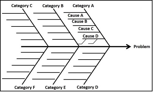
Nearly every cause is also an effect. Invariably, even the nominally terminal effect is the cause of suboptimal operations. Brainstorming is a subjective exercise during which all stakeholders contribute their thoughts on possible cause-effect relationships. The Post-it® array shown in Figure 1 illustrates one tool for capturing ideas floated during this brainstorming effort. On first pass, no ideas are rejected. The objectives are to identify as many contributing factors (causes, variables) as stakeholders can, collectively, and to map those factors as far out as possible – i.e., until stakeholders can no longer identify factors (causes) that might contribute – however remotely – to the terminal effect (i.e., the problem). Two other common tools used to facilitate brainstorming are fishbone (Ishikawa or herringbone) diagrams (Figures 3 and 4), and Cause-Effect (C-E) maps (Figure 5). Kaoru Ishikawa introduced fishbone diagrams in the 1960s. Figure 3 shows a generic fishbone diagram. The “spine” is a horizontal line that points to the problem. Typically, six Category lines radiate off the spine. Horizontal lines off of each category line are used to list causes related to that category. One or more sub-causes can be associated with each cause.

Fig 3. Generic fishbone diagram.

Figure 4 illustrates how a fishbone diagram can be used to visualize cause-effect relationships contributing to a balloon popping.

Fig 4. Fishbone diagram of factors possibly contributing a popped balloon.

The six categories – Environment, Measurement, Materials, Machinery, Methods, and Personnel – are among those most commonly used in fishbone diagramming. Keep in mind that at this point in RCA, the variables captured in the diagram are speculative. Only the fact that the balloon has popped is know for certain.

Fig 5. Cause-Effect (CE) map – popped balloon.

My preferred tool is C-E mapping. The cells in a C-E map suggest causal relationships – i.e., a causal path. This is similar to repeatedly asking: why?” and using the answers to create a map. In Figure 5, there are three proximal causes to the Balloon Popped effect. The balloon popped because it was punctured, over-heated, or overinflated. In this illustration only the possible causes of Punctured are illustrated. The two possible causes are Intention and Accident. In turn, Intention could have been the effect of either playfulness or anger. The accident could have been caused by handing the balloon with the wrong tool (hands with sharp nails?) or having applied too much pressure. Although Figure 5 shows three tiers of causes, it could be extended by several more tiers. For example, why was the individual handling the balloon angry? Why did whatever made them angry occur? As I’ll illustrate in a future article, one advantage of C-E mapping is that the entire diagram need not be shown in a single figure. Each listed cause at each tier can be used as the ultimate effect for a more detailed C-E map. Another advantage is that ancillary information can be provided alongside each cause cell (Figure 6).

Fig 6. Portion of Figure 5 showing ancillary information about balloon’s properties.

In my next article, I’ll continue my explanation of RCA, picking up the story with Define Current Knowledge and will use a biodeterioration case study to illustrate each step.

Summary

In RCA, the objective is to look beyond the proximal cause. My intention now is to explain why this is valuable. I recognize that some readers are Six-Sigma Black Belts who understand RCA quite well. Still, all too frequently, I encounter industry professionals who invariably focus no proximal causes and wonder why the same symptoms continually recur.

For more information, contact me at fredp@biodeterioration-control.com.
Minimizing Covid-19 Infection Risk In The Industrial Workplace


Electron microscopy image of the SARS-CoV-2 virus.


COVID-19 Infection Statistics

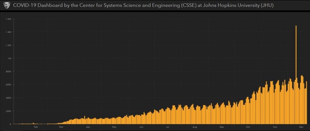
Although anti-COVD vaccines are rolling out and people are being immunized, as of early late December 2020, the rate at which daily, newly reported COVID-19 cases has continued to rise (Figure 1). In my 29 June 2020 What’s New article I discuss some of the limitations of such global statistics. In that post, I argued that the statistics would be more meaningful if the U.S. Centers for Disease Control’s (CDC’s) morbidity and mortality reporting standards were used. Apropos of COVID-19, morbidity refers to patients’ cases reported and having the disease and mortality refers to COVID-19 patients who die from their COVID-19 infection. Both morbidity and mortality are reported as ratios of incidence per 100,000 potentially exposed individuals. I illustrated this in my portion of an STLE webinar presented in July 2020.


Fig 1. Global incidence of new COVID-19 cases – daily statistics as of 23 December 2020 (source: coronavirusstatistics.org).


What Do the Infection Statistics Mean?

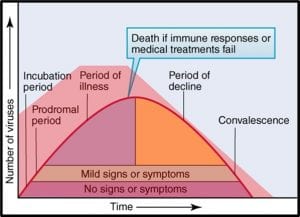
Social scientists, epidemiologists, and public health specialists continue to debate the details, but the general consensus is that the disease spreads most widely and rapidly when individuals ignore the fundamental risk-reduction guidelines. It appears that COVID 19 communicability is proportional to the number of SARS-CoV-2 virus particles to with individuals are exposed. Figure 2 illustrates the relative number of virus particles shed during the course of the disease.


Fig 2. Relationship between number of SARS-2CoV viruses shed and COVID-19 disease progression.


Notice that the number of viruses shed (or dispersed by sneezing, coughing, talking, and breathing) is quite large early on – before symptoms develop fully. It’s a bit more complicated than that, however. Not all infected individuals are equally likely to shed and spread the virus. All things being apparently equal, some – referred to as super-spreaders – are substantially more likely than others to infect others. Although people with or without symptoms can be super-spreaders, those who are infected but asymptomatic are particularly dangerous. These folks do not realize that they should be self-quarantining. A study published in the 06 November 2020 issue of Science (https://science.sciencemag.org/content/370/6517/691) reported that epidemiological examination of millions of COVID-19 cases in India revealed that 5 % of infected people were responsible for 80 % of the reported cases.

What Shall We Do While Waiting for Herd Immunity to Kick-In?

The best strategy for avoiding the disease is to keep yourself physically distanced form others. Unfortunately, this advise is all but worthless for most people. We use public transportation to commute to work. We teach in classrooms, work in offices, restaurants, medical facilities, and industrial facilities in which ventilation systems are unable to exchange air frequently enough to minimize virus exposure risk. The April 2020 ASHRE Position Document on Infectious Aerosols recommends the use of 100 % outdoor air instead of indoor air recirculation. The same document recommends the used of high-MERV (MERV – minimum efficiency removal value – 10-point scale indicating the percentage of 0.3 µm to 10 µm particles removed) or HEPA (HEPA – high efficiency particulate absorbing – able to remove >99.9% of 0.3µm particles from the air) filters on building HVAC systems. Again, as individuals who must go to work, shop for groceries, etc., outside our own homes, we have little control over building ventilation systems.

Repeatedly, CDC (Centers for Disease Control), HSE (UK’s Health and Safety Executive), and other similar agencies have offered basic guidance:

1. Wear face masks – the primary reasons for doing this is to keep you from transmitting aerosols and to remind you to keep your hands away from your face. Recent evidence suggests that that although masks (except for ones that meet N-95 criteria) are not very efficient at filtering viruses out of the air inhaled through them, they do provide some protection.

2. Practice social distancing to the extent possible. The generally accepted rule of thumb is maintaining at least 6 ft (1.8 m) distance between people. This is useful if you are in a well-ventilated space for relatively short periods of time but might be insufficient if you are spending hours in inadequately ventilated public, industrial, or institutional spaces.

3. Wash hands thoroughly (at least 30 sec in warm, soapy water) and frequently. The objective here is to reduce the chances of first touching a virus laden surface and then transferring viruses into your eyes, nose, or mouth.

Here are links to the most current guidance documents:

CDC – How to Protect Yourself and Othershttps://www.cdc.gov/coronavirus/2019-ncov/prevent-getting-sick/prevention.html

CDC – Interim Guidance for Businesses and Employers Responding to Coronavirus Disease 2019 (COVID-19), May 2020https://www.cdc.gov/coronavirus/2019-ncov/community/guidance-business-response.html

HSE – Making your workplace COVID-secure during the coronavirus pandemichttps://www.hse.gov.uk/coronavirus/working-safely/index.htm

UKLA- HSE Good Practice Guide – http://www.ukla.org.uk/wp-content/uploads/HSE-Good-Practice-Guide-Sept20-Web-LowresC.pdf – discusses health & safety in the metalworking environment.

WHO – Coronavirus disease (COVID-19) advice for the publichttps://www.who.int/emergencies/diseases/novel-coronavirus-2019/advice-for-public

Remember: Prevention really Means Risk Reduction

It is impossible to reduce the risk of contracting COVD-19 to zero. However, timely and prudent preventative measures can reduce the risk substantially so that people can work, shop, and interact with one another safely. Guidance details continue to evolve as researchers learn more about SAR-CoV-2 and its spread. However, the personal hygiene basics have not changed since the pandemic started a year ago. If each of us does our part, we will be able to reduce the daily rate of new cases dramatically, long before the majority of folks have been immunized.

For more information, contact me at fredp@biodeterioration-control.com

Sensitivity Training – Detection Limits Versus Control Limits


Meme from the 1986 movie, Heartbreak Ridge (Gunnery Sergeant Thomas Highway – Clint Eastwood – is providing sensitivity training to his Marines).


The Confusion

Over the past several months, I have received questions about the impact of test method sensitivity on control limits. In this post, I will do my best to explain why test method sensitivity and control limits are only indirectly related.

Definitions (all quotes are from ASTM’s online dictionary)

Accuracy – “a measure of the degree of conformity of a value generated by a specific procedure to the assumed or accepted true value and includes both precision and bias.”

Bias – “the persistent positive or negative deviation of the method average value from the assumed or accepted true value.”

Precision – “the degree of agreement of repeated measurements of the same parameter expressed quantitatively as the standard deviation computed from the results of a series of controlled determinations.”

Figures 1a and b illustrate these three concepts. Assume that each dot is a test result. The purple dots are results from Method 1 and the red dots are from Method 2. In figure 1a, the methods are equally precise – the spacing between the five red dots and between the five purple dots is the same. If these were actual measurements and we computed the average (AVG) values and standard deviations (s), s1 = s2. However, Method 1 is more accurate than Method 2 – the purple dots are clustered around the bull’s eye (the accepted true value) but the red dots are in the upper right-hand corner, away from the bull’s eye. The distance between the center of the cluster of red dots and the target’s center is Method 2’s bias.


Figure 1. Accuracy, precision, and bias – a) Methods 1 & 2 are equally precise, but Method 2 has a substantial bias; b) Methods 1 & 2 are equally accurate, but Method 1 is more precise – the dots are clustered closer together than those from Method 2.

Limit of Detection (LOD) – “numerical value, expressed in physical units or proportion, intended to represent the lowest level of reliable detection (a level which can be discriminated from zero with high probability while simultaneously allowing high probability of non-detection when blank samples are measured.” Typically test methods have a certain amount of background noise – non-zero instrument readings observed when the test is run on blanks (test specimens known to have none of the stuff being analyzed).

I have illustrated this in figures 2a through c. Figure 2a is a plot of the measured concentration (in mg kg-1) of a substance being analyzed (i.e., the anylate) by Test Method X. When ten blank samples (i.e., anylate-free) are tested, we get a background reading of 45 ± 4.1 mg kg-1. The LOD is set at three standard deviations (3s) above the average background reading. For test Method X, the average value is 45 mg kg-1 and the standard deviation (s) is 4.1 mg kg-1. The average + 3s = 57 mg kg-1. This means that, for specimens with unknown concentrations of the anylate, any test results <57 mg kg-1 would be reported as below the detection limit (BDL).

Now we will consider Test Method Y (figure 2b). This method yields background readings in the 4.1 mg kg-1 to 5.2 mg kg-1 range. The background readings are 4.4 ± 0.4 mg kg-1 and the LOD = 6 mg kg-1. Figure 2c shows the LODs of both methods. Because Method Y’s LOD is 48 mg kg-1 less than Method X’s LOD, it is rated as a more sensitive – i.e., it can provide reliable data at lower concentrations.


Figure 2 – Determining LOD – a) Method X background values = 45±4.1 mg kg-1 and LOD = 57 mg kg-1; b) background values = 4.4 mg kg-1 and LOD = 5.4 mg kg-1. Method Y has a lower LOD and is therefore more sensitive than Method X.

Limit of Quantification (LOQ) – “the lowest concentration at which the instrument can measure reliably with a defined error and confidence level.” Typically, the LOQ is defined as 10 x LOD. In the figure 1 example, Test Method X’s LOQ = 10 x 57 mg kg-1, or 570 mg kg-1, and Test Method Y’s LOQ = 10 x 6 mg kg-1, or 60 mg kg-1.

Type I Error – “a statement that a substance is present when it is not.” This type of error is often referred to as a false positive.

Type II Error – “a statement that a substance was not present (was not found) when the substance was present.” This type of error is often referred to as a false negative.

Control limits – “limits on a control chart that are used as criteria for signaling the need for action or for judging whether a set of data does or does not indicate a state of statistical control.”

Upper control limit (UCL) – “maximum value of the control chart statistic that indicates statistical control.”

Lower control limit (LCL) – “minimum value of the control chart statistic that indicates statistical control.”

Condition monitoring (CM) – “the recording and analyzing of data relating to the condition of equipment or machinery for the purpose of predictive maintenance or optimization of performance.” Actually, this CM definition also applies to condition of fluids (for example metalworking fluid concentration, lubricant viscosity, or contaminant concentrations).

Why worry about LOD & LOQ?

Taking measurements is integral to condition monitoring. As I will discuss below, we use those measurements to determine whether maintenance actions are needed. If we commit a Type I error and conclude that an action is needed when it is not, then we lose productivity and spend money unnecessarily. Conversely, if we commit a Type II error and conclude no action is needed, although it actually is, we risk failures and their associated costs. Figure 3 (same data as in figure 2c) illustrates the risks associated with data at the LOD and LOQ, respectively. Measurements at the LOD (6 mg kg-1) have a 5 % risk of being false positives (i.e., one measurement out every 20 is likely to be a false positive). At the LOQ (60 mg kg-1) the risk of obtaining a false positive is 1 % (i.e., one measurement out every 100 is likely to be a false positive). As illustrated in figure 3, in the range between LOD and LOQ, test result reliability improves as values approach the LOQ.

The most reliable data are those with values ≥LOQ. Common specification criteria and condition monitoring control limit for contaminants have no lower control limit (LCL). Frequently operators will record values that are LOD as zero (i.e., 0 mg kg-1). This is incorrect. These values should be recorded either as “LOD” – with the LOD noted somewhere on the chart or table – or as “X mg kg-1” – where X is the LOD’s value (6 mg kg-1 in our figure 3 example). In systems that are operating well, analyte data will mostly be LOD and few will be >LOQ. For data that fall between LOD and LOQ, a notation should be made to indicate that the results are estimates.


Figure 3. BDL (red zone – do not use data with values <LOD), >LOD but LOQ (amber zone – use data but indicate that values are estimates), ≥LOQ (green zone – data are most likely to be reliable).

Take home lesson – accuracy, precision, bias, LOD, and LOQ are all characteristics of a test method. They should be considered when defining control limits, but only to ensure that control limits do not expect data that the method cannot provide. More on this concept below.

Control Limits

Per the definition provided above, control limits are driven by system performance requirements. For example, if two moving parts need at least 1 cm space between them, the control limit for space between parts will be set at ≥1 cm. The test method used to measure the space can be a ruler accurate to ±1 mm (±0.1 cm) or a micrometer accurate to 10 μm (0.001 cm), but should not be a device that is cannot measure with ±1 cm precision.

Control limits for a given parameter are determined based on the effect that changes in that parameter’s values have on system operations. Referring back to figures 2a and b, assume that the parameter is water content in fuel and that for a particular fuel grade, the control objective was to keep the water concentration ([H2O]) < 500 mg kg-1. Method X’s LOD and LOQ are 57 mg kg-1 and 570 mg kg-1, respectively. Method Y’s LOD and LOQ are 5.4 mg kg-1 and 54 mg kg-1, respectively. Although both methods will detect 500 mg kg-1, under most conditions, Method Y is the preferred protocol.

Figure 4 illustrates the reason for this. Imagine that Methods X & Y are two test methods for determining total water in fuel. [H2O] = 500 mg kg-1 is near, but less than Method X’s LOQ. This means that whenever water is detected a maintenance action will be triggered. In contrast, because [H2O] = 500 mg kg-1 is 10x Method Y’s LOQ, a considerable amount of predictive data can be obtained while [H2O] is between 54 mg kg-1 and 500 mg kg-1. Method Y data detects an unequivocal trend of increased [H2O] five months before [H2O] reaches its 500 mg kg-1 UCL and four months earlier than Method X detects the trend.

Note that the control limit for [H2O] is based on risk to the fuel and fuel system, not the test methods’ respective capabilities. Method Y’s increased sensitivity does not affect the control limit.


Figure 4. Value of using method with lower LOD & LOQ. Method Y is more sensitive than Method X. Therefore, it captures useful data in the [H2O] range that is BDL by Method X. Consequently, for Method X the reaction interval (period between observing trend and requiring maintenance action) is shorter than for Method Y and more disruptive to operations.

A number of factors must be considered before setting control limits. I will address them in more detail in a future blog. In this blog I will use jet fuel microbiological control limits to illustrate my point.

Historically the only method available was culture testing (see Fuel and Fuel System Microbiology Part 12 – July 2017 Fuel and Fuel System Microbiology Part 12 – July 2017). The UCL for negligible growth was set at 4 CFU mL-1 (4,000 CFU L-1) in fuel and 1,000 CFU mL-1 in fuel associated water. By Method ASTM D7978 (0.1 to 0.5 mL fuel is placed into a nutrient medium in a vial and incubated) 4,000 CFU L-1 = 8 colonies visible in the vial after incubating a 0.5 mL specimen. For colony counts the LOQ = 20 CFU visible in a nutrient medium vial (i.e., 40,000 CFU L-1). As non-culture methods were developed and standardized (ASTM D7463 and D7687 for adenosine triphosphate; ASTM D8070 for antigens), the UCLs were set, based on the correlation between the non-culture method and culture test results.

Figure 5 compares monthly data for culture (ASTM D7978) and ATP (ASTM D7687) in fuel samples. The ASTM D7979 LOD and LOQ are provided above. The ASTM D7687 LOD and LOQ are is 1 pg mL-1 and 5 pg mL-1, respectively. The figure 5, green dashed lines show the respective LOD. The D7978 and D7687 action limits (i.e., UCL) between negligible and moderate contamination are 4,000 CFU L-1 and 10 pg mL-1, respectively (figure 5, red dashed line). The figure illustrates that over the course of 30 months, none of the culture data were ≥LOQCFU . In contrast, 22 ATP data points were ≥LOQ[cATP] and five occasions, D7687 detected bioburdens >UCL when D7978 data indicated that CFU L-1 were either BDL or UCL.

Additionally, as illustrated by the black error bars in figure 5, the difference of ±1 colony in a D7978 vial has a substantial effect on the results. For the 11 results that were >BDL, but <4,000 CFU L-1, the error bars indicate a substantial Type II error risk – i.e., assigning a negligible score when the culturable bioburden was actually >UCL. Because D7687 is a more sensitive test, the risk of making a Type II error is much lower. Moreover, because there is a considerable zone between D7687’s LOQ and the UCL, it can be used to identify data trends while microbial contamination is below the UCL.


Figure 5. Fuel microbiology data by ASTM D7987 (CFU L-1) and D7687 ([cATP] (pg mL-1). For 22 of 30 monthly samples [cATP] > LOD & LOQ, only 3 samples have [cATP] > UCL. For CFU L-1, LOQ (20,000 CFU L-1) = 5x UCL. Error bars show 95 % confidence range for each data point (for CFU the error bars are ± 1 CFU vial-1; ± 1,000 CFU L-1, and for [cATP] they are ±1 pg mL-1)

Summary

Accuracy, precision, and sensitivity are functions of test methods. Control limits are based on performance requirements. Control limits should not be changed when more sensitive test methods become available. They should only be changed when other observations indicate that the control limit is either too conservative (overestimates risk) or too optimistic (underestimates risk).

Factors including cost and level of effort per test, and the delay between starting the test should be considered when selecting condition monitoring methods. However, the most important consideration is whether the method is sufficiently sensitive. Ideally, the UCL should be ≥5x LOQ. The LOQ = 10x LOD and the LOD = AVG + 3s based on tests run on 5 to 10 blank samples.

Your Thoughts?

I’m writing this to stimulate discussion, so please share your thoughts either by writing to me at fredp@biodeterioration-control.com or commenting to my LinkedIn post.

OUR SERVICES

  • Consulting Services
  • Condition Monitoring
  • Microbial Audits
  • Training and Education
  • Biocide Market Opportunity Analysis
  • Antimicrobial Pesticide Selection

REQUEST INFORMATION


    captcha